Over the last couple of years, smartphone brands have focused on delivering a fluid software experience, stunning blur effects and textures, and a full embrace of the AI trend. Enter ColorOS 17, a skin that’ll run on all OPPO, OnePlus, and Realme phones going forward after the latter two companies officially sunsetted OxygenOS and Realme UI, respectively. With the tagline “Silky Smooth. Flow with AI”, the latest ColorOS iteration promises an even livelier experience, packaging all the above-stated aspects into the software.
So how does the spiritual successor to OxygenOS 16 actually feel in day-to-day use? Find out in this detailed hands-on, where we tested a pre-release version of ColorOS 17 over several weeks on the OnePlus 15 to check out the new changes, improvements, and features.
Table of Contents
Living Flow Design: seamless transitions, bounciness and luminous effects
ColorOS 17 takes OnePlus’ Flow Motion from OxygenOS 16 to a higher level. For instance, when using the Flux Clock widget, from your first interaction on the fingerprint scanner to unlocking the phone and reaching the home screen, the clock seamlessly reacts based on where it’s positioned. While this animation is available in specific clock styles, the entire UI is filled with flowing elements grouped under ‘Living Flow Design’.
A major highlight of Living Flow Design is its responsiveness to taps and swipes. During my brief time with ColorOS 17, every element, from the quick settings panel to Live Alerts, three-dot menus, and overlay buttons, illuminates on interaction, creating impressive immersion. Lively, bouncy animations and translucent visuals match the luminous effects across the UI, which can be witnessed by pressing and stretching a menu or button with high intensity. As soon as you release your finger, the element returns to its original state while delivering a soothing bounce.


While this was just a gist of Living Flow Design, ColorOS 17 adapts to the new design language in multiple areas:
Seamless page and pop-up transitions
In first-party apps such as Settings, Photos, Notes, Recorder, and more, moving from one page or section to another uses a morphing animation for seamless behaviour. You can see this on the ‘Home screen & Lock screen’ page when selecting sections like Wallpapers, Icons, and others. Similarly, tapping any three-dot menu triggers a flying-like animation before revealing the options list.
Floating navigation bar
Following the current trend, ColorOS 17 transforms the bottom navigation buttons into a floating bar in system apps. Like iOS 27 and One UI 9, the navigation bar appears over the content when you scroll through an app. This is most noticeable in the Clock app, where the text behind the bar blurs out.
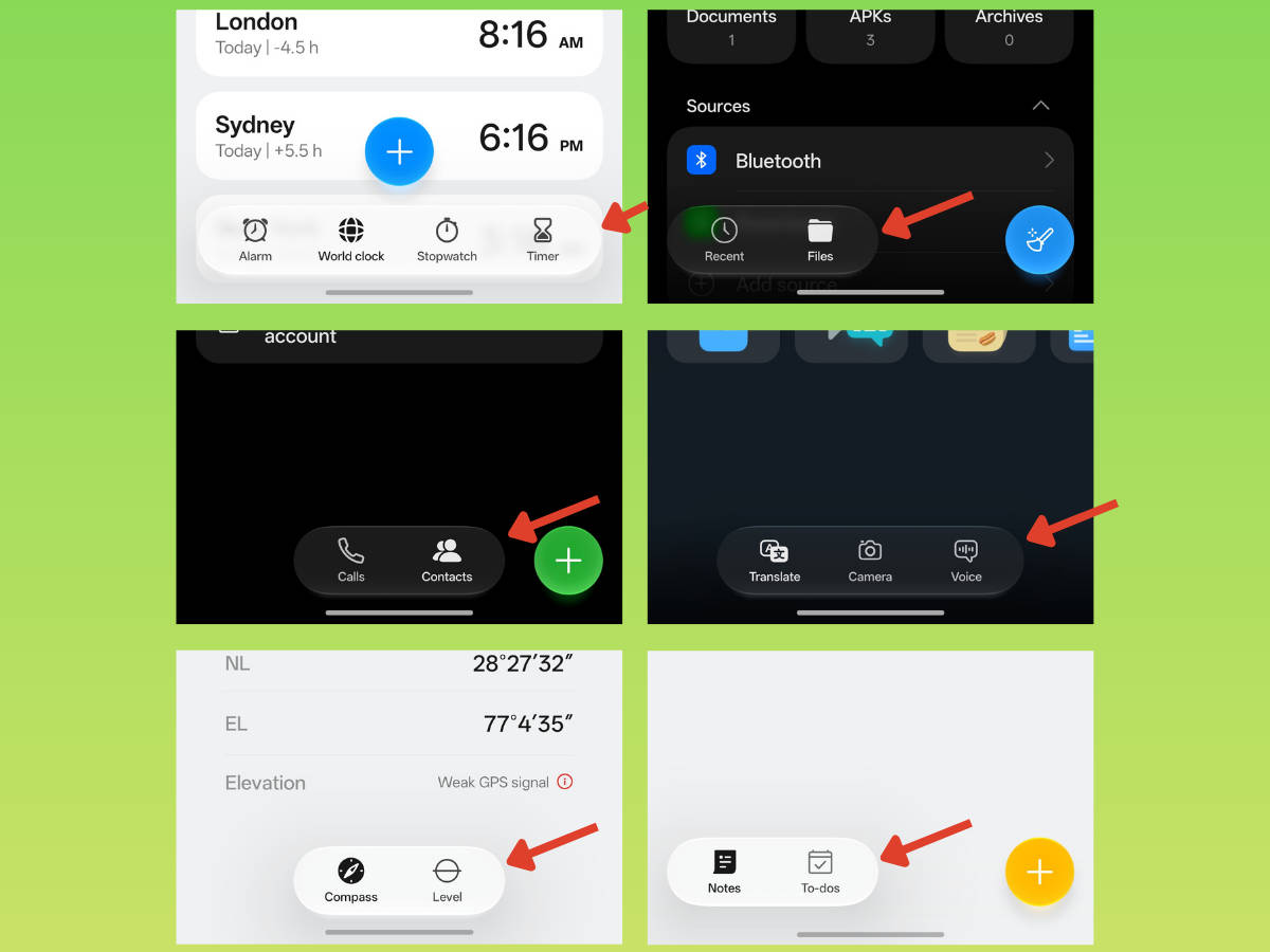
In OxygenOS 16, progressive blur was largely limited to the App Drawer and Photos app. ColorOS 17 raises the stakes by bringing this visually appealing design to more apps, such as Settings, Clock, Notes, File Manager, and more. For the uninitiated, progressive blur mimics natural camera depth-of-field (bokeh), helping users distinguish what is in the foreground versus the background.
Glassy quick settings panel
While the core functionality of the quick settings panel hasn’t changed much, since it still doesn’t offer the flexibility to resize the quick toggles into various layouts found on iOS 27 or One UI 9, the Gaussian blur has taken a back seat in favour of a more transparent effect paired with contour glow on the borders of the toggles. Similarly, notifications use the same Luminous effects found throughout the UI. Expanding or collapsing them uses an elastic effect.


Redesigned Live Alerts
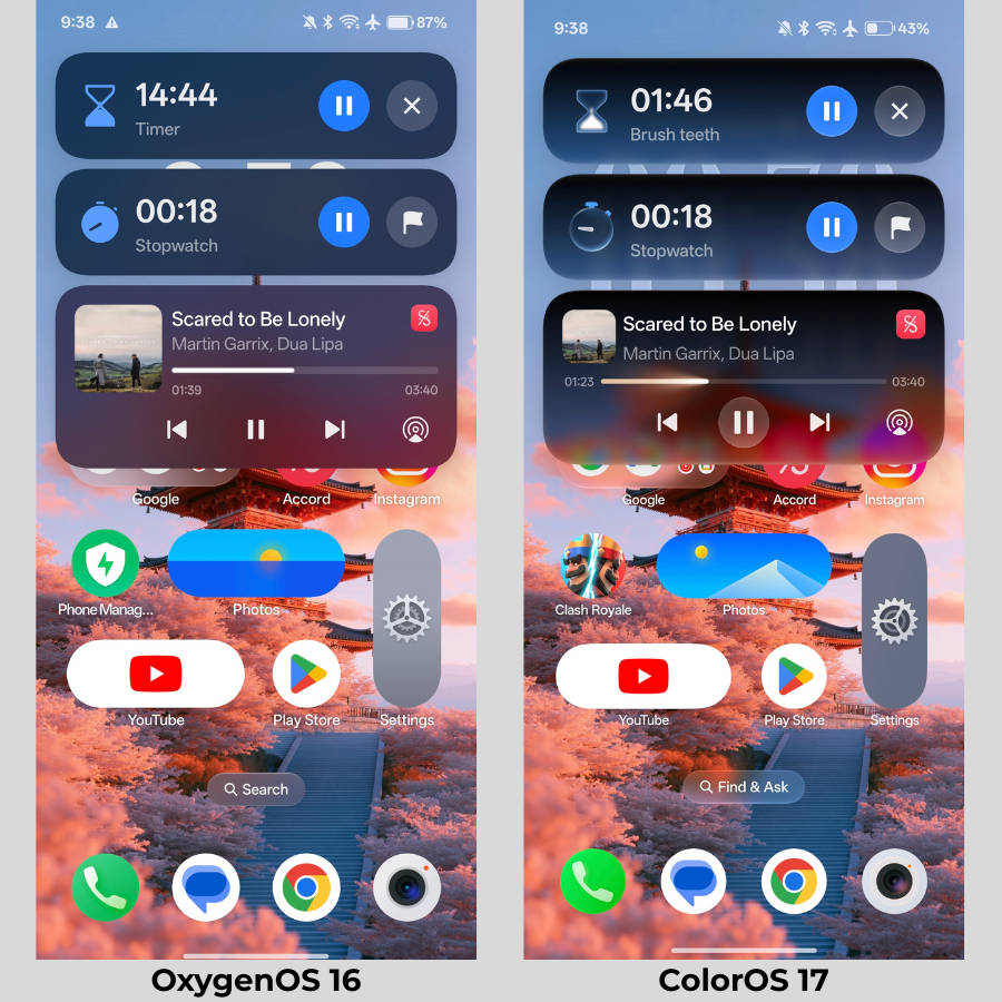
Like the quick settings panels, the Live Alerts interface has received a new translucent, Luminous design treatment. Like the Siri AI Dynamic Island design, Live Alerts on COS 17 feature a gradient-like finish that fades to transparency toward the bottom. Furthermore, the Music Live Alert displays a glowy seekbar with shaded border effects that match the album art’s colour. Personally, I found this highly impressive, and it seems someone put serious dedication into it.


Tweaked sidebar transparency and animation
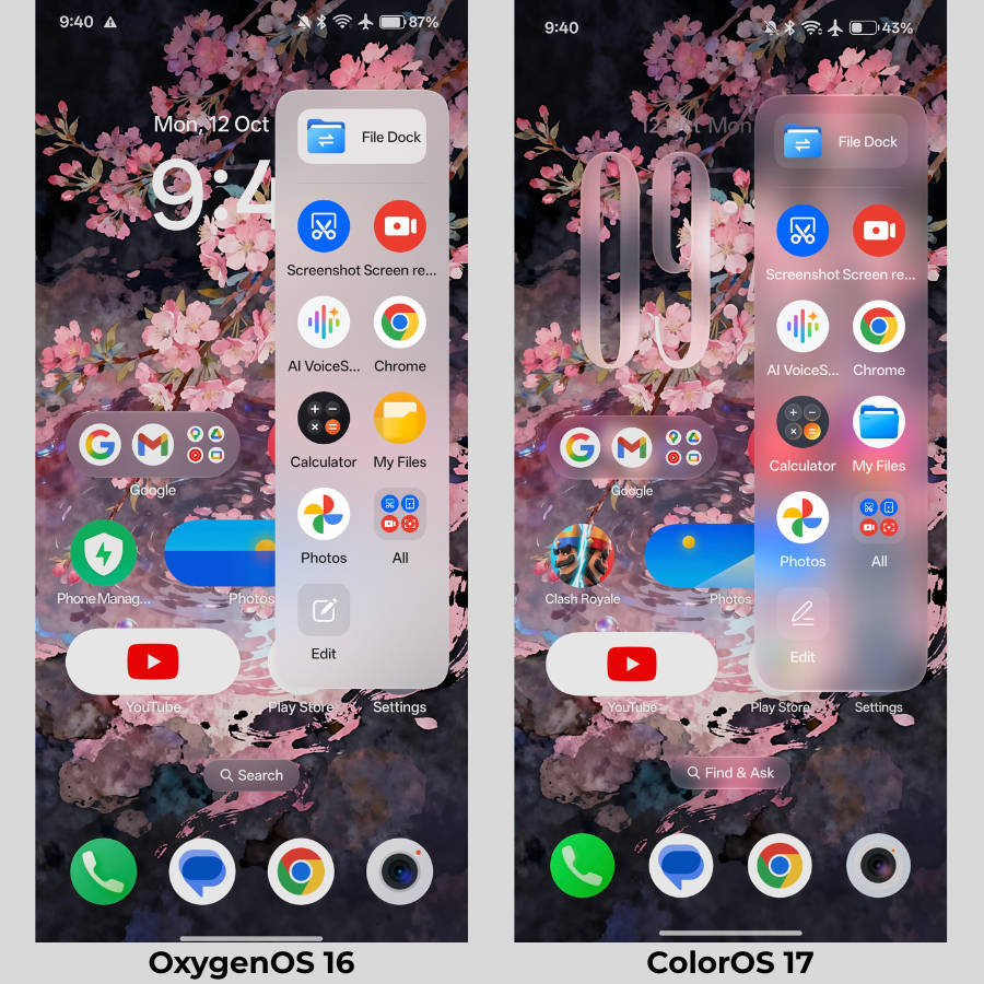
If you thought the sidebar reveal animation on OxygenOS 16 was extraordinary, wait till you try ColorOS 17. While the generic layout stays the same, the swipe-from-the-edge animation to open the sidebar feels more extensive and charming, paired with nice glassy translucency effects.
Customisation: just got better
Since OxygenOS 16 and ColorOS 16 introduced a host of customisation options, such as large lockscreen clock fonts, dark theme icons, enlarged icons, and revamped accent theming by ditching Google’s Monet theming, ColorOS 17 simply improves on the existing functionality. This totally makes sense since the personalisation options were already sufficient, to the point that other software skins need to catch up to ColorOS’ level.
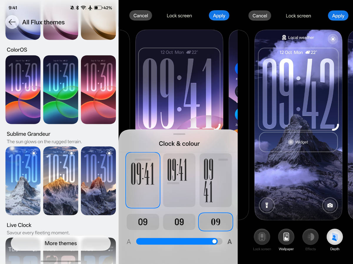
As for what’s actually new, the large lockscreen clock fonts finally get the option to display a colon (:). To add it, simply drag right from the corner, or drag left to remove the colon. Like HyperOS, ColorOS 17 also adds lockscreen weather themes that react to local weather in real time and display effects such as rain, fog, sun, and others.
On the home screen, as noted above, ColorOS 17 adds a slew of Flux Clock widgets, while the rest of the personalisation options stay the same. However, coming from OxygenOS 16, you’ll find OnePlus has dropped the distinct OxygenOS icons refined over the years in favour of ColorOS app icons.
New game manager UI
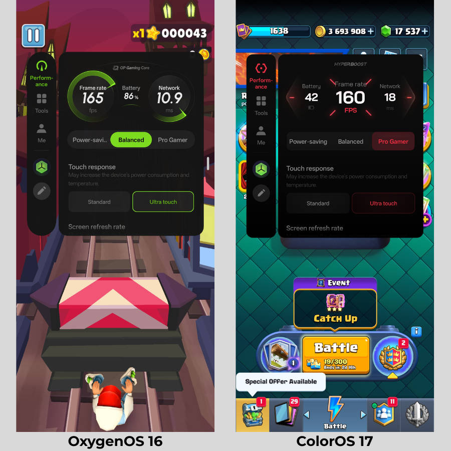
When summoning the game manager and going to the “Me” section, you’ll find a brand new ‘Esports’ theme, which revamps the look and feel of the UI, making it look more futuristic and sci-fi. Since switching, I haven’t gone back to the previous theme.
Remembering OxygenOS: just a few traces left
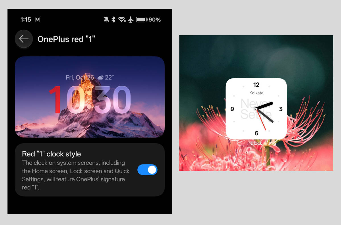
Over the years, OnePlus added small details to OxygenOS that gave it its own identity, even after merging with and using the ColorOS codebase since 2021. This included using its own app icons, a custom two-tone monochrome theme, ‘Never Settle’ easter eggs scattered throughout the UI, and more. Fast forward to ColorOS 17, and OnePlus has dropped most core OxygenOS elements, especially the cosmetic ones.
This includes the “Never Settle” text in the world clock, the “Never Settle” animation in Calculator when entering “1+=”, a major highlight of OxygenOS 16’s unveiling, and the special tone that played when dialling “1+” in the Phone app. Similarly, OnePlus ditched the OG OxygenOS camera icon. Fortunately, the iconic red “1” hour clock in the lock screen and status bar has been retained, while a particular Clock widget continues to display the “Never Settle” text.
Performance boost: several under-the-hood improvements
As with every major OS upgrade, ColorOS 17 includes several under-the-hood performance improvements. With this iteration, a new rendering architecture called Luminous Rendering Engine has been introduced, which promises up to 25 percent less RAM usage for rendering key scenarios and up to 30 percent less rendering load. While I won’t dive deep into jargon, this means the system is optimised to use less memory to render smooth, flowing animations.
In real-world scenarios, every swipe on ColorOS 17 is silky smooth and responsive, and I expected nothing less. Whether you’re opening or closing apps, unlocking the phone, or scrolling through Photos, the system delivers fluid interactivity. Easily one of the best out there.
OnePlus AI: major AI advancements made
What’s a major OS upgrade in 2026 without new AI features and advancements, right? So ColorOS 17 not only builds on existing AI features, but also adds new features to help users with their workflow and daily productivity.
The biggest new addition this time around is AI Mind Pilot, a prompt-based system that combines ChatGPT, Perplexity, and Gemini to deliver relevant results based on the given query. What makes this special is its ‘Agent Mode’, which, as the name suggests, is an Agentic AI that can execute tasks based on the prompts. It can work around by accessing local files, photos, and documents to organise, collect, or modify them.
When I asked it to create a collage from the flower photos in the gallery, it completed the task in a few minutes and delivered a usable result. Similarly, it can look through files and photos and pull out the information you need, simply by typing or speaking. I can definitely see this coming in handy for sorting a large chunk of files into a folder, or finding specific information or notes in PDFs and documents, as I tried out in the screenshots below.

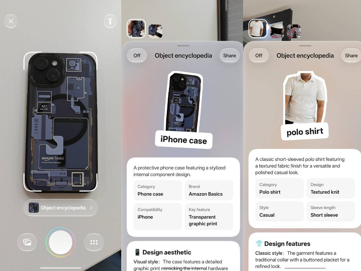
Introduced over a year ago with the OnePlus 13s, AI Mind Space can now proactively scan saved content and suggest reminders and departure countdowns, such as for flights or trains, through Live Alerts and the AI Suggest home screen widget. Next up is the OSee app. Built into ColorOS 17, OSee helps users scan and look up information quickly with AI. For example, if you point the camera at an apparel item, it’ll pull up styling suggestions for how to pair it with other clothing. Consider this an advanced version of Google Lens, but from the house of OnePlus and OPPO.
Closing thoughts
After using ColorOS 17 for well over three weeks, I can safely say I had the most enjoyable experience using a software skin since ColorOS 16 and OxygenOS 16. True to its nature, the update again delivers a noticeable uplift in smoothness and fluid interactivity, especially with the addition of Living Flow Design, given how it flawlessly transitions between pages, menus, and sections within the UI. The elasticity, bounciness, and luminous elements make things feel lively, while the new translucency effect creates more depth than the Gaussian blur in OxygenOS 16.
On the AI front, the company has also put in dedicated effort by introducing Agent Mode in Mind Pilot, which can dig deep into the system and pull out, sort, and organise information in a few minutes. Neat stuff here. Lately, agentic AIs are entering the picture, such as Google’s Gemini Spark and Grok Bot, so it makes sense for OnePlus to implement its own system-level AI agent. Then there’s OSee, which finds information by just pointing the camera. Both implementations should proactively assist users in their professional and personal lives, especially for routine tasks.
Overall, while core OnePlus users may miss the cosmetic additions and easter eggs from OxygenOS, ColorOS 17 as a whole delivers an immaculate experience in usability, personalisation, and AI functionality. Since it continues to carry OxygenOS’ philosophy of being fast and smooth, it’ll genuinely leave anyone impressed after a few minutes of use.