Nothing Phone (4a) design reveal shows the brand still refuses to play it safe


Nothing is anything but predictable when it comes to design. This is a welcome change to see in a sea of phones that look only marginally different from their predecessors. But Nothing isn’t happy about rehashing the same design year-after-year. Now, this can be good or bad depending on whom you ask. A quick look at the comments under the Nothing Phone (4a)’s design X post shows a divided fanbase, with some lauding the new look while others prefer the Phone 3a series, particularly the Glyph lights on those models. This isn’t something new. Nothing has seen this before, more recently with the Phone (3), and something tells me Nothing enjoys this, maybe even thrives on it.
Personally, I think the Phone (4a) looks great. It’s familiar in some ways, but also very different from what we’ve seen in the past. Let me explain:
A return to form?
The design reveal of the Phone (4a) immediately brings back the pre-Phone (3) phones to mind. The Nothing Phone (3), the brand’s flagship phone for 2025 (and 2026), arguably had the most divisive design, with many fans being put off by the asymmetrical rear camera system and the Glyph Matrix circular display. Again, the design of the Phone (3) wasn’t what bothered me most about the flagship, and you can read my thoughts about it here. But it was a wild design language, no doubt, that took longer to get used to than previous phones from Nothing.
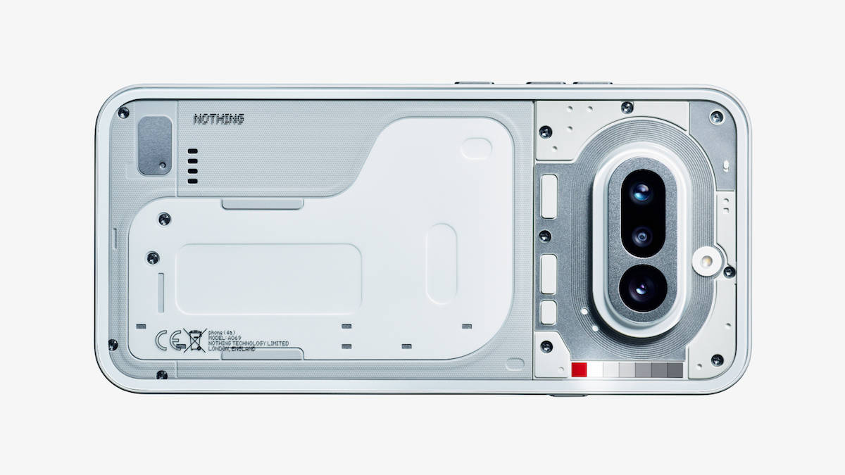
The upcoming Phone (4a), however, keeps it cleaner, with a symmetrical, horizontal camera module much like its predecessor, the Phone (3a). There are three camera sensors on the back, details of which should be known soon enough, a transparent design with a dual-tone lower portion, in shades of white and grey. Rumours and teasers suggest a few more colour options in tow, including blue and pink.


The design reveal also shows new button placements: the Essential Key moves to the left, and the volume and power buttons move to the right. This makes more sense, as it keeps the familiar, most-used buttons on one side and the dedicated AI button on the other. Based on the image shared, the Essential Key is placed above the centre, which should make it more comfortable and less prone to accidental presses, which was an issue on the predecessor.
Lights will guide you
Remember when I said Nothing isn’t predictable? Nowhere is that clearer than in its evolving Glyph Interface. Each generation has taken a different approach. The Phone (1) scattered LED strips across the back. The Phone (2a) and (3a) streamlined them into three bold arcs around the camera module. The flagship Phone (3) went all in on a circular Glyph Matrix.


Nothing hasn’t detailed all the use cases yet, but it’s safe to assume the essentials remain: notifications, calls, charging indicators, and possibly app-specific cues. Placing the LEDs along one side gives the back a cleaner, more structured look. It’s less busy than before, but still unmistakably Nothing.
Will everyone love it? Probably not. Some fans may miss the more dramatic light patterns of earlier models. But that’s the point. Nothing isn’t interested in preserving nostalgia. It’s interested in evolving its visual language, even if that means splitting opinion along the way.
At a time when many brands are content with minor tweaks and safe iterations, Nothing continues to treat design as its main differentiator. The Phone (4a) may not reinvent the transparent aesthetic, but it shows there’s still room to reinterpret it. Whether you prefer the older Glyph layouts or this new Glyph Bar approach, one thing is clear: Nothing refuses to let its designs go stale. And in a market full of phones that blur into one another, that willingness to experiment might be its biggest strength.

