iOS 26 beta hands-on: Liquid Glass is kind of nice, redesigned Calls and Photos apps are great


The iOS 26 public beta is finally out this week, and I’ve installed it on my iPhone 16 Pro Max, so you don’t have to. Or you could, if you feel convinced it’s worth upgrading to after reading through this article. iOS 26 – yes, Apple has jumped a few version numbers from iOS 18 – brings one of the biggest visual redesigns in years, with Liquid Glass leading the way. While I will discuss my thoughts on the Liquid Glass design, I will also touch upon a few other areas of iOS 26 that I particularly liked (and a few that I haven’t warmed up to yet) during my brief time using the public beta update.
How liquid is Liquid Glass?
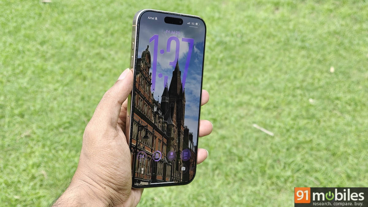
Liquid Glass is Apple’s new approach to making certain UI elements appear, as the name suggests, like liquid glass. As Apple says, Liquid Glass features the “optical qualities of glass and a sense of fluidity across the Lock Screen, Home Screen, Control Centre, apps and more”. The idea behind this design is to bring more focus to your content. So, from the moment you update to iOS 26, you’ll see elements on the lock screen, app icons, control panel, widgets and more have a translucent look, like they’re floating on transparent glass.


The effect extends to button interactions, which now respond to your touch with subtle, fluid animations – like moving your finger on a drop of water on a glass surface. It looks great most of the time, and something many would get used to in no time.
Apple tweaked the translucent effect of Liquid Glass, adjusting its intensity over several developer beta updates. On the public beta, the transparency of Liquid Glass feels just about right in most cases, although notifications on the lock screen still appear too transparent and are therefore less readable. You have the option to reduce transparency in Accessibility settings to make the interface look more iOS 18-like.
Liquid Glass appears visually appealing, and it feels like a step in the right direction for Apple. I don’t doubt that Apple will take a few more updates to fine-tune the transparent elements, especially how they appear in notification boxes on the lock screen, over the next few months until the stable version rolls out.
Calls and Photos redesign are my personal favourites
Apple has redesigned several of its native apps, but the two that really stood out for me are Calls and Photos. The Calls app is now more unified than before, merging favourite contacts, recent calls, and voicemail on one screen – they were previously separate tabs until iOS 18. Favourites appear as rectangular thumbnails at the top, while recent calls appear below. And if you don’t like this new unified design (It’s hard to imagine going back once you try it), you do have the option to switch back to the older layout.

The new Photos redesign looks great as well. Apple has simplified the default library to only show your gallery photos in slightly bigger thumbnails than before. Everything else, including your albums, people and pets, memories, and more, can be found in a separate Collections tab. I love this because I’m someone who prefers looking at photos in my library over searching for specific people or albums. The new layout brings focus back to the library, and the bigger grid view makes it easier to scroll through and view at a glance.

There are tons of other visual changes to talk about, such as the relocation of the search bar to the bottom of the screen across the UI, making it easier to reach and type compared to before, when it was placed at the top and would have been a one-handed struggle if you’re a Pro Max or Plus user.
Visual Intelligence has expanded beyond the Camera to screenshots. Now, whenever you take a screenshot, you’ll get a preview of the image and see suggestions from Apple Intelligence. For example, if you take a screenshot of a landmark, options appear at the bottom of the screen to run an image search or ask ChatGPT for more information. You can even circle a specific area on the image if you prefer.

iOS 26 has a lot more going on, and I’ve mainly spoken about the ones that instantly caught my attention. As I mentioned earlier, the Liquid Glass design appears visually appealing in most cases, but there are areas in the UI where it still feels distracting and annoying. I hope Apple addresses these issues before the stable version is released later this year. If you want to try out Liquid Glass and redesigned apps, you can download the iOS 26 public beta update via Settings > General > Software Updates > Beta Updates > iOS 26 Public Beta. Please remember to back up your data before updating, as a public beta version typically includes bugs and glitches.

