Nothing OS 5.0 hands-on: taking bold steps in the right direction


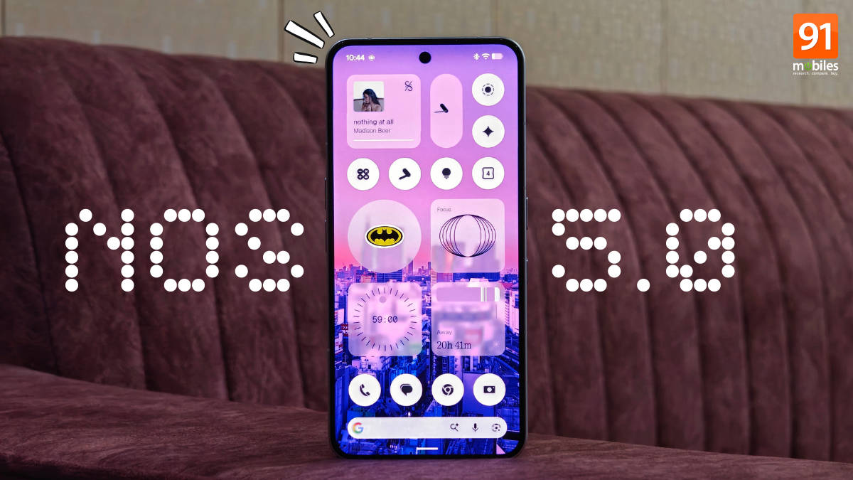
Nothing OS 5.0 has officially arrived on the Phone (3), at least in Open Beta form. Announced in late August, Nothing calls it its biggest release yet, packing over 80 new changes. While staying true to its roots of a minimal, distraction-free Android experience, the update takes bold steps in design, introduces long-awaited features, and boosts overall performance. Built on Android 17, we take a full hands-on look at Nothing OS 5.0, detailing the key changes and features and sharing our thoughts on areas where it could still improve. Read on!
Note: This hands-on piece is based on the first Nothing OS 5.0 Open Beta update for the Phone (3). Therefore, with future updates, things may change for better or worse. Also, if you’re wondering when Nothing OS 5.0 will arrive on your device, feel free to check out our update roundup.
Table of Contents
Personalisation is up a notch
Some much-needed hints of blur
After much waiting, Nothing OS sees hints of blur and translucency, something most Android skins have been adapting to deliver a sense of depth to their UI. This comes in the form of the Lucent theme under the ‘Theme & Style’ setting in the Launcher menu. Once selected, all your widgets, quick settings shortcuts, and folders feature a translucent look, revealing hints of the homescreen wallpaper.
Additionally, when pulling down the new separate quick settings panel (more on this later), the background gradually blurs as the panel takes over the screen. Coming from ColorOS and HyperOS, I really liked this implementation for its design complexity. However, I hope Nothing adds similar blur effects in other parts of the UI, especially when opening and closing applications, since most other skins on high-end phones behave similarly.
Homescreen batch editing
To make homescreen customisation and layout changes easier, Nothing OS 5.0 introduces app batch editing, where users can press and hold an empty space and tap the ‘Arrange’ button to move the apps they wish to another row or page. Established skins like ColorOS and HyperOS have had this feature for a while now, so it’s great to see Nothing bringing it to offer convenient homescreen editing.
In fact, Motorola has also added app batch editing to its phones with the Android 17 update.
Lockscreen clock colours (finally!)
By default, Nothing OS flaunts a white coloured lockscreen clock, irrespective of the clock face you choose. This often made the time text illegible when you applied a white or light-shade-dominant wallpaper. Fortunately, Nothing OS 5.0 fixes this by finally introducing colours for the clock, which adapt to your lockscreen’s wallpaper and result in a contrasty look.


Improved spacing and new typeface, iconography
NothingOS 5.0 removes unnecessary spacing in first-party apps, such as Settings, and makes menus more compact to fit more items on a single screen. It also gets rid of the ‘Inter’ font in favour of ‘Geist’, Nothing’s new typeface that was already present on Nothing’s platforms like the Playground website. You’ll also find refreshed icon menus in the Settings app and status bar, which I feel now closely match Pixel UI.
More and more widgets
Nothing OS has always revolved around widgets to make things easier to access since its inception. The latest update adds even more widgets, including the Away Time widget, which calculates how long you’ve been away from your phone and prompts you to stay away from your device more. The other two new widgets include Collector, which lets users curate sticker-like images on the homescreen from the Gallery or camera, and the Glyph Timer widget, which lets users set the Glyph timer duration without going into the Settings app.
I actually found myself using all three widgets during my time with Nothing OS 5.0. That said, I can see many people who’re into homescreen customisation heavily using the Collector widget to display their favourite images or characters. What’s more, you can set the widget to refresh the image every time you unlock the phone.
New apps and functionalities
Separate quick settings panel
Apart from Pixel UI, Nothing OS was the last-standing Android skin not to feature a separate quick settings panel, where swiping from the left side of the status bar reveals all your notifications, while the right side summons the quick settings toggle. This changes with NOS 5.0, as you can choose between the Classic (old) and Separate panels.
The new Separate panel includes all the editing features of the old panel, such as manually resizing the toggles and placing them anywhere, while also introducing vertical brightness and volume sliders for easy access and a minimised music player up top. Since I’ve been using the separate-style quick setting panel on OxygenOS for almost two years now, this brings a sense of familiarity, making it easier for users to transition from other skins to Nothing OS thanks to the similar approach.
Reworked camera app
The Camera app has received some tweaks, making it not only smoother to operate but also featuring reworked animations. When toggling the aspect ratio, it displays a curtain-opening-like animation.
Glyph features, all in one place
Despite being essential functionality on Nothing smartphones, all Glyph-related features were previously buried in the Settings app. With Nothing OS 5.0, a new Glyph app has been introduced in which every Glyph function now resides. This includes changing the Essential Notifications settings, selecting the specific Glyph toy (on Nothing Phone (3) and Phone (4a) Pro) to set, starting a Glyph Timer, and toggling Always-on Glyph Toy, Flip to Glyph, Volume indicator, and Glyph progress.


But that’s not all, since the ‘Sounds’ section within the Glyph app lets you change the notification and ringtones and their subsequent Glyph styles without needing to open Settings.
Under-the-hood improvements
Since it’s a major release, Nothing has also tuned the system for better performance and responsiveness. While I already found Nothing OS 4.1 on Phone (3) to be quite snappy and swift, Nothing claims it’s improved everyday interactions by making animations smoother, optimising memory to hold more apps at once, and tuning background resources to offer greater endurance.

Android 17 goodies
Quick Share to iPhone
Per my testing, while you still can’t directly share media using Quick Share to an AirDrop-supported device, such as an iPhone or MacBook, like Google Pixel phones and Samsung Galaxy S26 series, Android 17 on Nothing phones introduces a workaround. All you need to do is select the media file you wish to share and then select the QR code button. Now ask the iPhone user to scan the QR code using the Camera app, which will then initiate the transfer via the browser.

Noto 3D Emojis
As part of Google’s Android 17 release, Nothing OS 5.0 has revamped the entire emoji collection by giving them a 3D look. These are the same emojis that recently debuted on the Pixel 11 series and have already been rolled out to other Android 17-based skins, such as One UI 9 and Motorola’s Android 17 update.
Updated privacy indicators
Previously limited to microphone and camera usage, Nothing OS 5.0 adds more privacy indicators, such as location and AI, to give a sense of what’s running in the background. The mic and camera indicators are denoted by green dots, while location usage is indicated by blue dots. And when an Essential AI process is running, it’s denoted by a yellow dot with an asterisk.
Enhanced HDR brightness slider
If you feel the default brightness during HDR content playback is too high or too low, an ‘Enhanced HDR brightness’ setting has been added in Nothing OS 5.0, giving users full control over HDR brightness via a slider.

Some small yet impactful changes
- Torch intensity: Just like in Pixel UI, pressing and holding the ‘Torch’ quick setting tile brings up an intensity slider, allowing you to adjust the torch’s output.
- Smaller navigation bar: The navigation bar at the bottom of the screen is now shorter.
- Status bar icon animations: The status bar has gone dynamic. For instance, when enabling Aeroplane mode, the aeroplane icon flies up from the bottom while the signal and WiFi icons fluently move to the right.
- New wallpaper: In the ‘Themes & style’ section, there’s a new green-shaded wallpaper dedicated to Nothing OS 5.0.
- New screen recording interface: Tapping the screen recording toggle opens a new interface, and recording is indicated by a pill-shaped icon on the left side of the status bar.
- Live Updates: In addition to Google Maps, core functions like the timer and stopwatch now support Live Updates. Several delivery apps, like Swiggy and Zomato, also offer Live Updates.
Scope for improvement
Nothing OS 5.0, despite being a major release, leaves room for improvement. As things currently stand in the first Open Beta build on the Nothing Phone (3), I feel the icons should also adapt to the new translucent Lucent theme, like the widgets and quick toggles, resulting in a cohesive homescreen look.
Secondly, compared to others like ColorOS and OriginOS, especially on high-end phones and flagship devices, Nothing OS could do with more layering and depth in the interface by integrating more blur details and textures in several places, such as the quick settings panel, like Pixel UI and lock screen clocks, for a more immersive look and feel.
Thirdly, Nothing’s midrange phones like the Phone (4a) and even last year’s Phone (3a) house a strong X-axis haptics motor, but Nothing OS 5.0 does nothing (no pun intended) to improve haptics integration in the software. Unlike ColorOS and Pixel UI, sliding the brightness or volume slider, scrolling through the Recents page, reaching the end of a page, or locking the phone doesn’t offer any haptic feedback. I would, personally, like to see more interactive feedback in future Nothing OS releases.
Thoughts
Overall, Nothing OS 5.0 is a major step up from Nothing 4.1 in several areas, including personalisation, ease of use, and smooth interactivity, even though lingering issues persist. I feel users will have a great time playing around with the new coloured clock faces, while the Lucent theme, new set of widgets, batch app editing, and 3D Noto emojis bring a much-needed freshness to the UI.