Spec sheets stopped impressing me somewhere around my third year of writing about phones. Chips got faster each year, cameras got sharper, batteries started lasting into a second day, and after a point those upgrades began blurring into one another. What kept genuinely changing how I used a phone was the software sitting on top of all that hardware.
That took me a while to admit, because software almost feels harder to justify. Nobody walks into a store and asks to see the file manager. While you immediately notice the new design right away, appreciate the display in one glance, and can even take a few pictures to check out the camera, understanding how good an OS is, really takes some time with the phone.
Table of Contents
What actually makes an operating system good?
Think about an ordinary weekday. Before lunch I have probably replied to messages across three apps, hunted for a document someone sent me last month, moved a meeting, paid for something over UPI, sent photos to a family group that will forward them right back to me, and pulled a file off my phone because I needed it on my laptop.
Almost none of that is one app doing one job. It is the operating system carrying things between apps, and mostly you notice it only when it gets in the way.
An OS today sits behind:
- finding information you saved earlier
- managing everyday tasks
- using AI
- editing photos
- moving between apps
- customising how the interface looks and behaves
- connecting your phone to your other devices
This is why the interesting question has shifted. For years we asked what a phone could do. The better question now is how much easier the software makes it to do the things you were going to do anyway.
OPPO’s ColorOS 16 moved that bar, and it did it fairly quietly
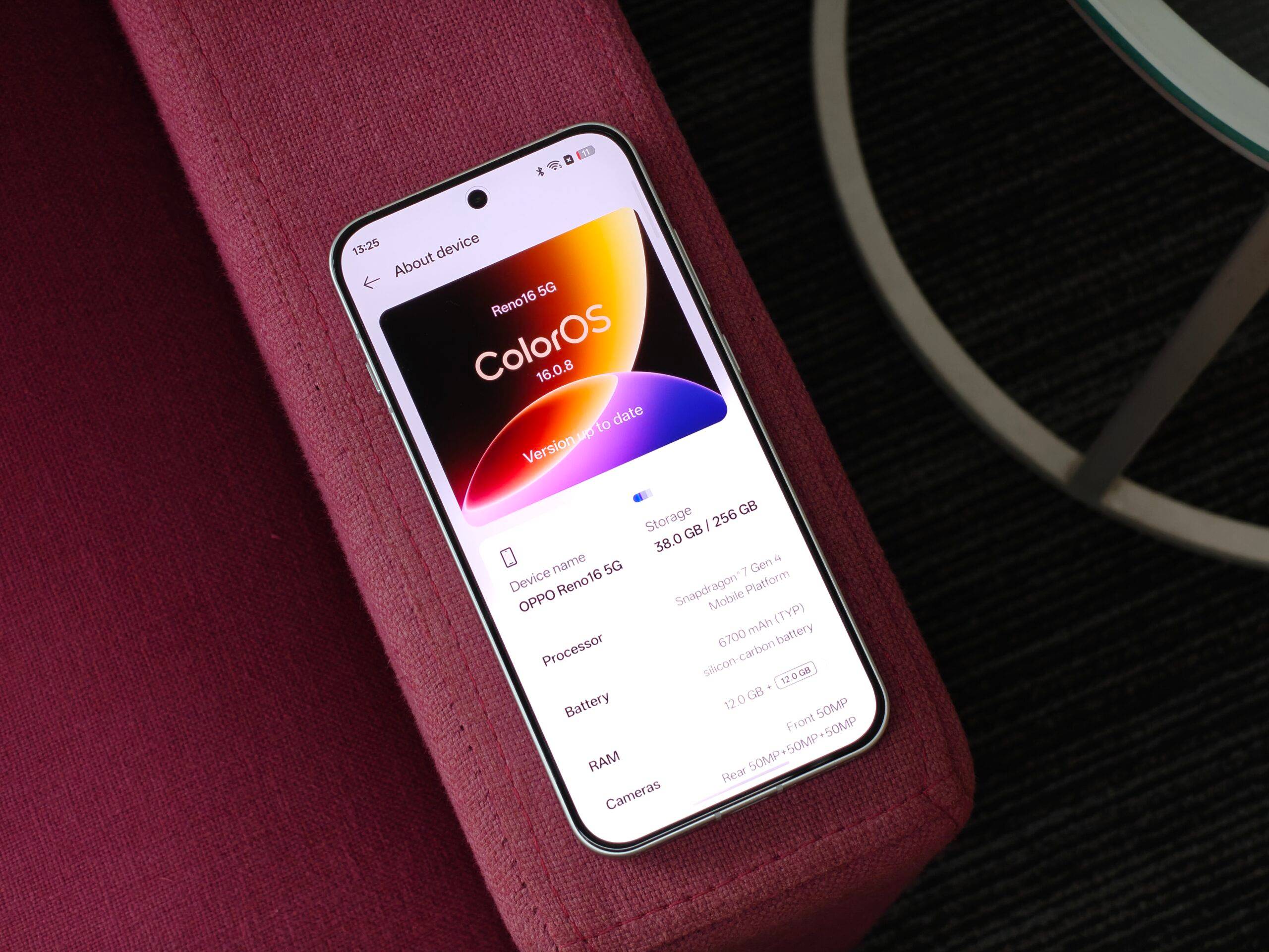
I did not have a single dramatic moment with ColorOS 16. What I had instead was a slow accumulation of small annoyances that stopped happening.
My screenshots stopped vanishing into the void
I screenshot compulsively. A restaurant someone recommended, a shirt I might buy later, a reference for work, a train timing. The screenshots were never the problem. Finding them three weeks later was.
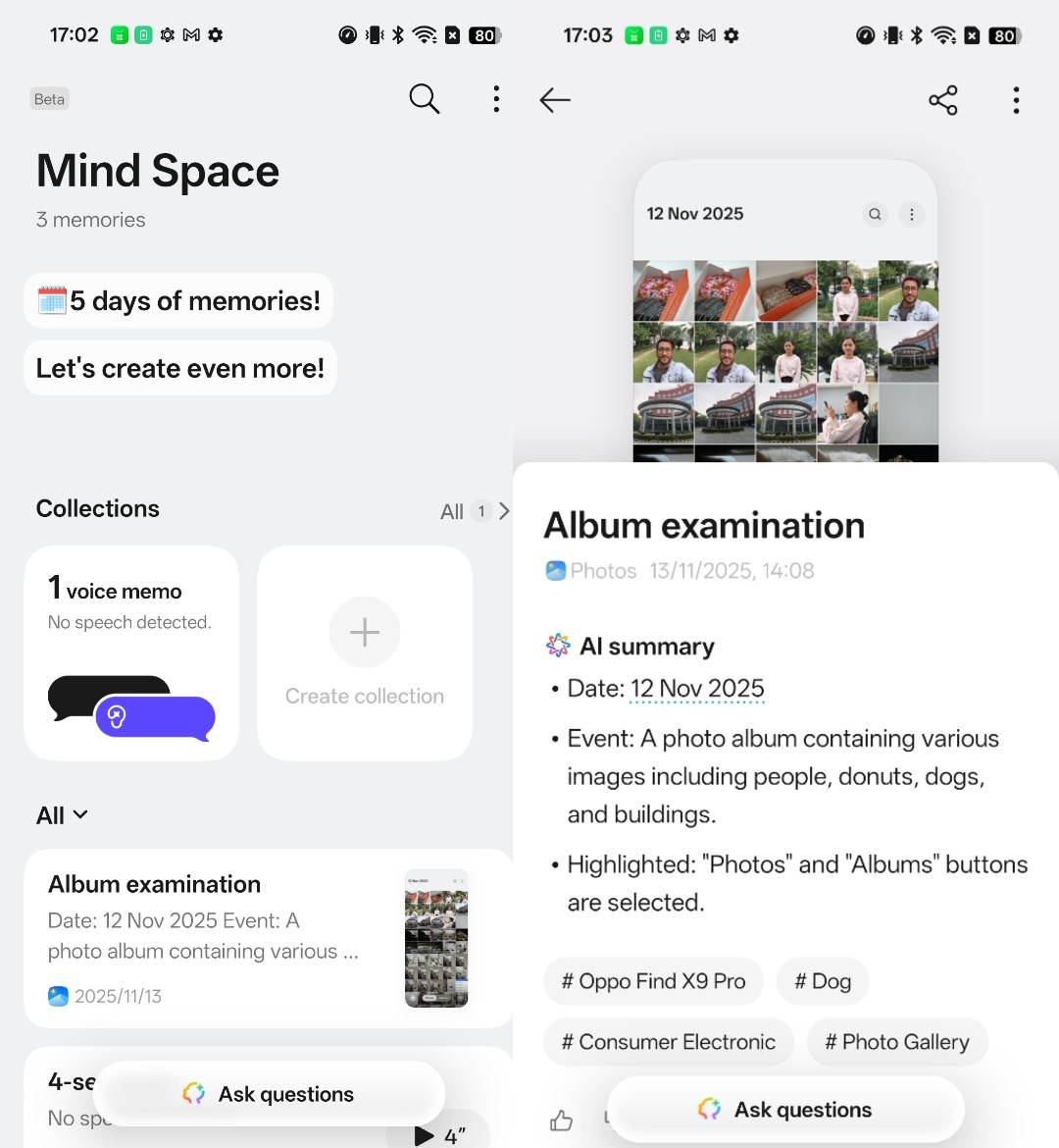
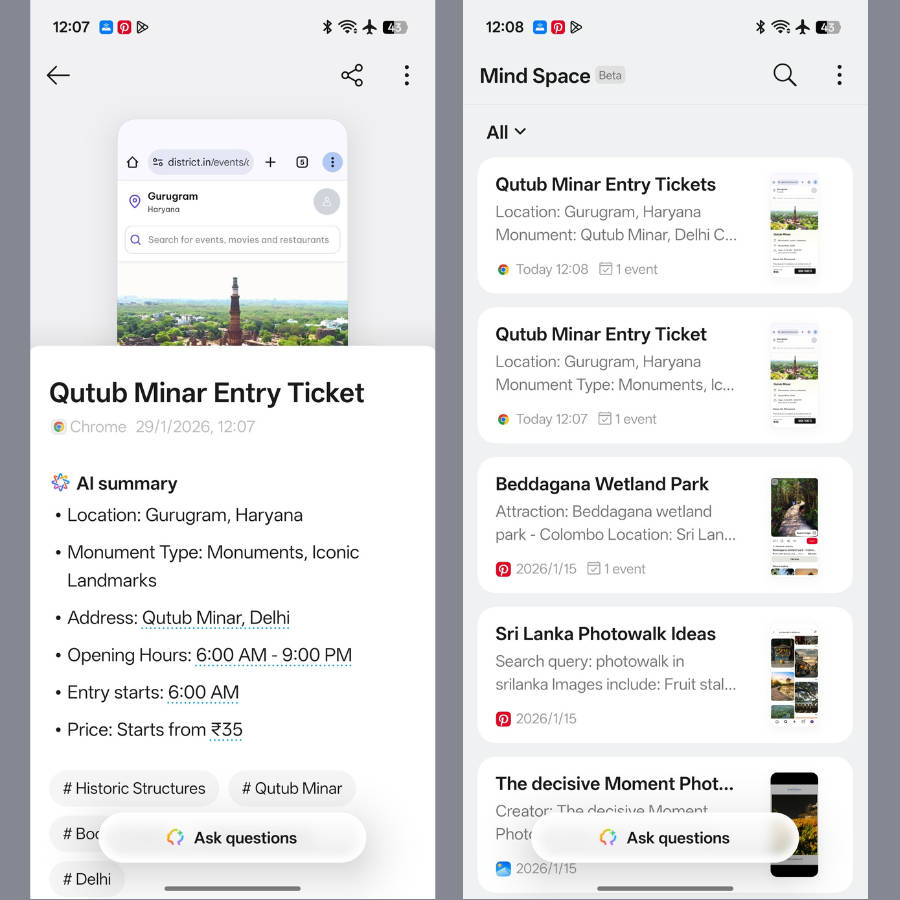
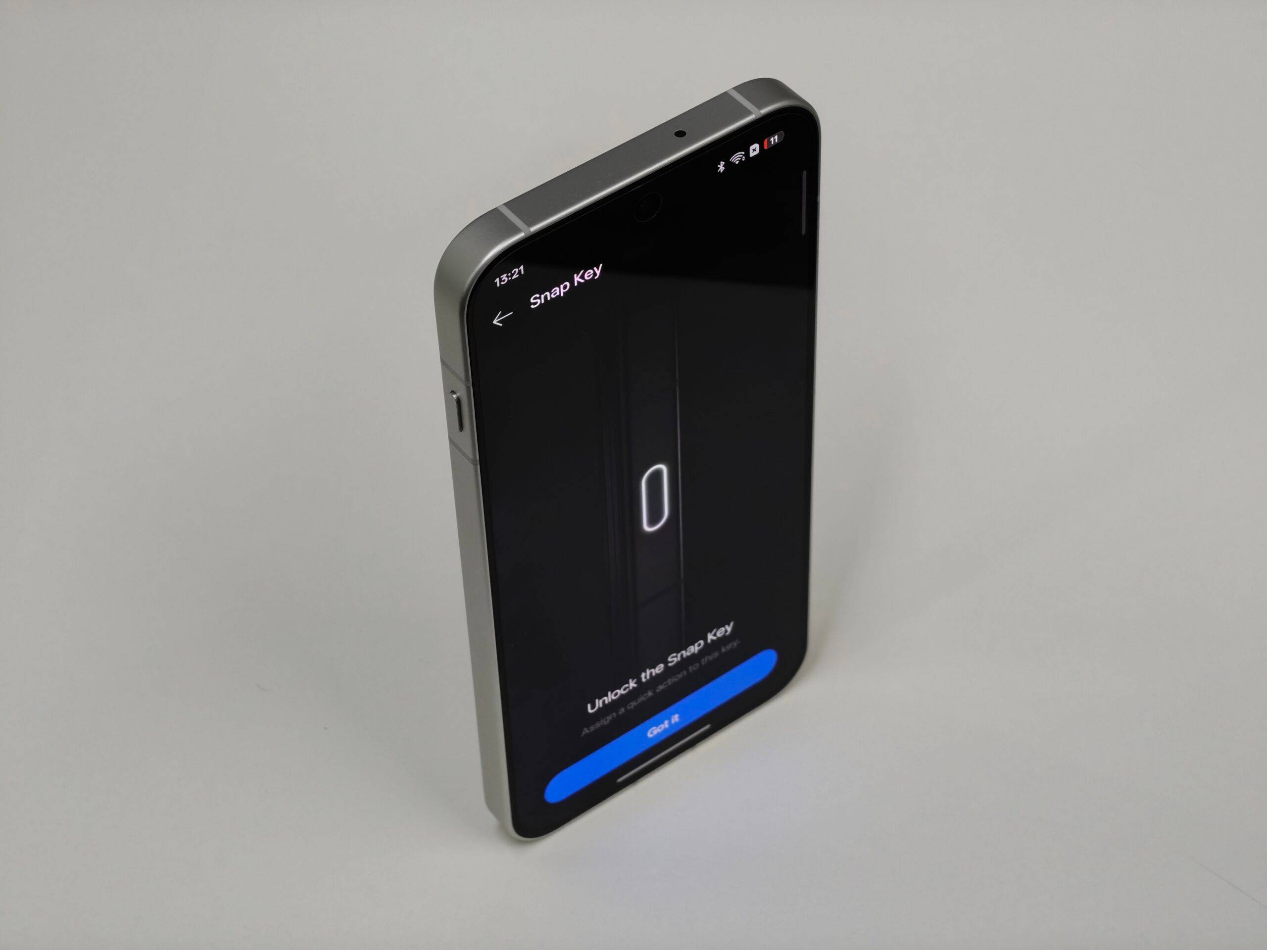
AI Mind Space gave all of that a home. On phones with the Snap Key, saving something takes one press, and Smart Collections group related material together instead of leaving it scattered across the gallery. My habit did not change one bit. The ten minutes I used to lose looking for things did.
AI that does something, rather than just answering something
This is where my expectations shifted the most. Plenty of phones now ship with a chatbot bolted on somewhere, and I had stopped paying attention to those.
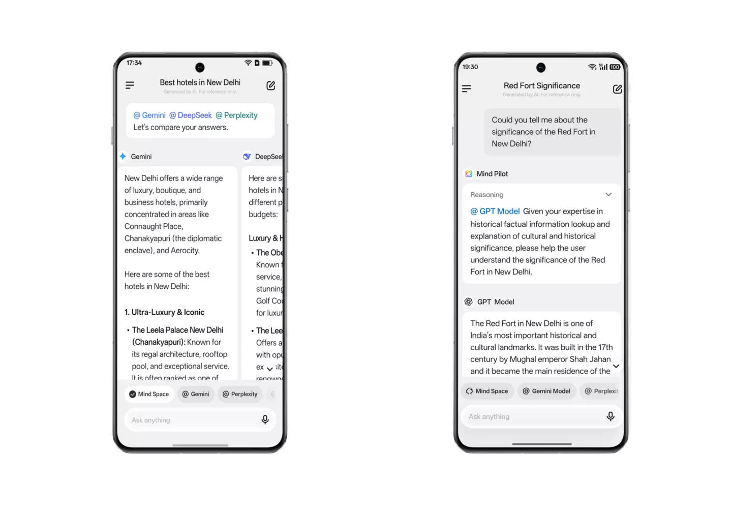
AI Mind Pilot works differently because it puts Gemini, ChatGPT and Perplexity in one place, so I can ask, verify and then pull the useful bits together without collecting six browser tabs along the way. AI Summary handles the long stuff I would otherwise skim badly. AI Recorder has quietly become the feature I defend most in arguments, because it titles and summarises recordings, which means a one-hour conversation becomes something I can actually search later.
The little chores nobody wants to do
Finding an old payment used to be a small scavenger hunt through UPI history, messages and email. AI Bill Manager saves those details into Mind Space, so going back to a transaction does not mean retracing every step you took to make it.
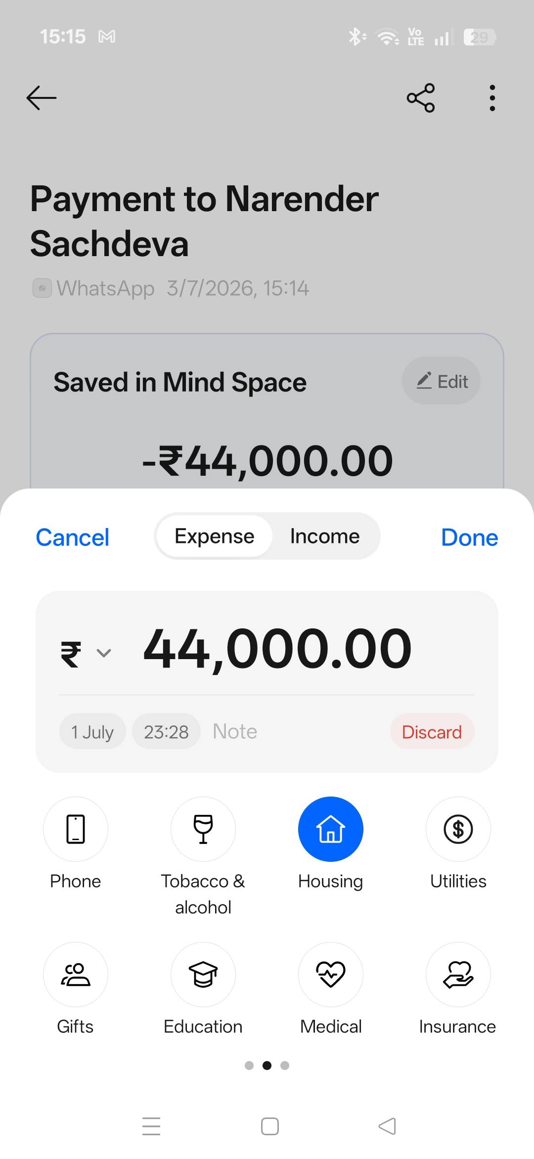
It is not a feature anyone puts on a poster. I use it constantly.
Photos I would otherwise have deleted
I am an average photographer at best, and I have a talent for taking the good group shot at the exact moment one person blinks. AI Editor has rescued more images than I expected. AI Eraser clears out the stranger who wandered into frame, AI Reflection Remover deals with glass, AI Unblur salvages the shot where my hand moved, and AI Perfect Shot picks the frame where everyone actually has their eyes open.
The point is not that any one of these is magic. It is that fixing a photo no longer requires opening a second app and pretending I know what I am doing.
A home screen that finally looks like mine
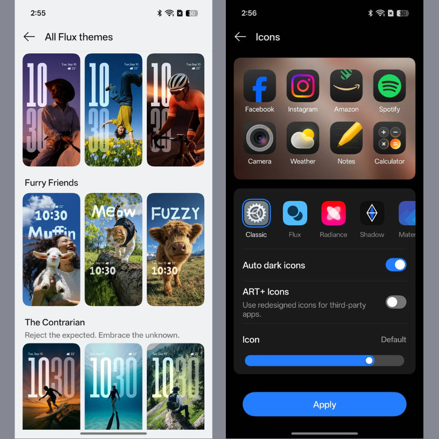
Personalisation is the part of Android I enjoy most and the part I usually abandon after a week. Flux Home Screen made it stick, partly because arranging icons and folders the way I want does not feel like fighting a template.
The Snap Key adds to that, since you can point it at whatever you use most rather than whatever the manufacturer decided.
Once you live with this, your expectations quietly move
Here is the thing about good software. You adapt to it in about a fortnight, and then you cannot go back.
A few weeks in, I caught myself wanting more, which I think says something about the direction ColorOS 16 set. If AI can organise what I save, could it get better at understanding which of it actually matters? If the phone helps with individual tasks, could it become more aware of what I am in the middle of? If the interface bends to my preferences, how much further could that go? And if everyday interactions already feel smooth, what would make them feel genuinely natural?
None of those are complaints. They are the sort of questions you only start asking once the basics have been handled.
What can ColorOS 17 do from here?
A clarification before I go further. What follows is not a feature list, and I have no inside information about anything. It is one user’s wish list, built from the expectations ColorOS 16 created.
- Make the AI more contextual. Right now I still tell the phone what I need. The more interesting step would be software that has a sense of what I am doing and what usually comes next, so that help arrives at the right moment instead of waiting to be summoned. Imagine Mind Space knowing that the twelve things I saved last week were all about the same trip, before I say so.
- Make the interface feel even more fluid. ColorOS 16 already handles transitions well. The next generation could make the whole thing feel more physical, where elements respond to touch the way objects respond to being pushed. Small stuff, and the kind of small stuff you feel a hundred times a day.
- Take personalisation further than looks. Right now I can change how the phone appears. What if I could shape what it surfaces and when, so the software organises itself around my routine rather than around a default that assumes everyone works the same way?
- Remove more of the small steps. Most friction on a phone is not dramatic. It is three taps where one would do. Whittling down the distance between wanting something and having it done seems like the most useful direction any OS can take right now.
Questions, all of them. Worth asking, though.
The bigger question is how the next OS should feel
After ColorOS 16, I no longer think the benchmark is a longer feature list. Every brand can produce one of those, and most of them do, twice a year.
What I want to know about the next generation is simpler. Does it make the phone more useful on an ordinary day? Is it more personal, in a way that survives past the first week? Does it respond the way I expect? Does it ask less of me than the version before it? And does it fit the specific, slightly messy way I actually use my phone, rather than the way a product demo assumes I do?
Get those right and the feature list takes care of itself. That is why the next version is worth paying attention to, and honestly, that is a better position for OPPO to be in than any spec sheet could have delivered.
This is a promotional post done as part of a brand collaboration.