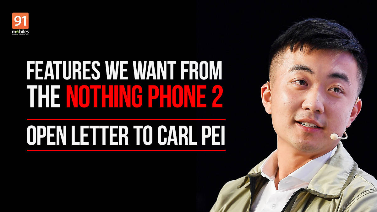
Dear Mr Pei,
We hope this letter finds you in the prime of mental and physical health. First of all, we would like to thank you. This is because we firmly believe you managed to deliver on the promise you made when you first entered the smartphone market with your new brand, Nothing. Your departure from OnePlus was no less than a shock to us and most of the tech world. After all, things were going so well. OnePlus had become one of the top brands (which it still is) and was successfully branching into other tech segments (which it still is). But then we heard the news that you were all set to part ways with the company and it left us wondering what you were going to do next.

It wasn’t long before you announced that you would be starting a new tech brand called Nothing. Believe us, we were both relieved and excited. With this new initiative you promised that you would be defibrillating the seemingly dead tech world and will be bringing excitement back into the scene. Initially, we thought you were just bluffing, trying to get attention. But when you launched your first gadget in 2021, the Nothing Ear (1), we realised that these promises weren’t empty and you actually meant to deliver the excitement you had promised back in the day. The same happened in the year 2022, when you released the Nothing Phone (1) and the Nothing Ear (Stick). All of these gadgets were so unique and distinct looking that Nothing as a brand became the design benchmark for all other TWS and smartphones in the industry.

Naturally, our hopes were high for the next product you were going to launch. You had obviously started talking about releasing the successors of the very striking Nothing Ear (1) and we were expecting you to bring the same Nothing level of design innovation in the Nothing Ear (2) as well. We were, however, rather disappointed when the Nothing Ear (2) ended up looking almost exactly the same as their predecessors, the Nothing Ear (1). The brand that had promised us excitement had seemingly fallen prey to the very pattern it had once aimed to break.
Now, the next talk of the town is the successor of the Nothing Phone (1), the Phone (2). And as those who have loved Nothing designs and the experiences the gadgets bring along, we hope we will not see a repeat of the “new specs in old package” phenomenon that we saw in the Nothing Ear (2). This is why we are here with a few suggestions you can eye.
Don’t get us wrong. We are not telling you how to do your job. These suggestions are not about the usual tech improvements that many suggest to brands. We are not asking you to bring more RAM, more megapixels, bigger display or even a more powerful processor. Those are basic asks and most successors come with these improvements anyway. The Ear (2) did those too. But what we are asking of you is to bring changes that would help the Phone (2) stand out and make the experience of the device better, and be consistent with the Nothing ethos as we have come to know it.

First things first, you have to make the next Nothing Phone more solid and sturdy. We get that you tried to do something different with the Nothing Phone (1) and even managed to make it look completely out of this tech world but some units… especially ones sold in the initial lots, did have a few issues. And in this day and age, you cannot have such problems with the build quality of the phone. So, with the Phone (2), we request that however distinct or normal you might make the phone look, just make sure it is sturdy. It really is just quite a basic ask.
The upcoming suggestions do not stem from criticism, Carl. They just make use of the design base you have already offered us with the Phone (1) and try to amp it up a bit.

Next in line would be colours. Yes, black and white are good but can you imagine how good the Phone (2) would look in pastel colours that are a rage at the moment. And to take things up a notch, you could even add the same coloured LEDs to the back, instead of sticking to the white ones. Oh, how a purple Nothing Phone would simply hit the spot!
While we are on the back, we wish the next phone from you would bring more view of the insides than the last one did. Yes, it was quite aesthetically pleasing to see a slight glimpse of those mechanical innards of the Phone (1)’s back but just imagine how cool it would be if the Phone (2) gave us a glimpse of even more of what’s inside. We know putting all the insides on show might not be a great idea but we wish you would increase the proportions with the next phone.

When you released the Nothing Phone (1), the tech world was bowled over by the Glyph UI. It goes without saying we love the feature too. But just to make Glyph UI slightly more easy and accessible to use on the Nothing Phone (2) (assuming that there are LEDs on the next one (we so hope there are!!), you could perhaps make an app exclusively for Glyph UI. This would mean that instead of having to deep sea diving in the Settings app to look for Glyph UI features, one could simply open the app and access all the features of the UI.
The Phone (1) also uses all of the LED lights on the back of the phone as flash which looks good as a party trick but we have realised that it can result in too much light more often than not, which can ruin low light pictures taken by the Phone (1). With the Phone (2), it would be great if you could add the option to customise how much flash light one needs and this could be one of the features of the Glyph UI app.

One of the USPs of the Nothing Phone (1) was its minimalist UI. You claimed the phone was as close to stock Android as possible and while the geek in us loved that, we wish the shades of retro that you showcased in the Phone (1) like the dotted font or some of the icons, would get more prominent and also prevalent. We think, maybe adding a 4-bit like font or icons or simply taking a retro route to make the NothingOS look as distinct as the outside of the phone would make the Phone (2) experience even more standout. Of course, those who do not like it can change it. And while we are on Glyph UI, what about having wallpapers for the lock screen that are inspired by it? I mean, it would look crazy cool, if the lock screen front and back of the phone looked the same from the front, and we could tell who is calling by looking at the lighting patterns on front or back.
It goes without saying, these are all just suggestions and ideas that we had for the Nothing Phone (2). You don’t really need to go about them in this specific manner. The chances are that you might have something even better than this in mind – after all, we could not have thought of the Phone (1) or the Ear (1). Even though our faith was a little shaken after the Ear (2), we still have it in place. We hope you will do justice to the Nothing name and bring the excitement back to our tech lives with the Phone (2). To us, Nothing matters more. Pun intended.
May the Tech Force be with you.
Sincerely,
Excitement hungry tech-journos
 model number leaked, spotted on BIS")
 gets Nothing OS 2.5.5 update: what’s new, features, how to install")
 launching in India on April 18th, company reveals")
 earbuds")
 India price range tipped; will reportedly come with Snapdragon 8s Gen 3 chipset")


 vs Nothing Phone (2) battery comparison: does the new phone outlast the flagship?")
")
 review: nothing quite like it!")

