Nothing Phone 3 gets a few things wrong, but design isn’t one of them


Let’s get one thing out of the way. The Nothing Phone (3) has a few things going against it. It costs Rs 80,000 but features a chipset typically found in phones priced under Rs 40,000. Nothing fans and tech enthusiasts are voicing their dissatisfaction on platforms like X, and they have good reason to. Another thing that has people divided is the design. Yes, it’s different. Yes, the cameras aren’t exactly aligned. Yes, Nothing knows this. And yes, this was by choice.
Personally, I’m on the side that appreciates the design, and I think I get what Nothing’s aiming for. Hear me out.
Nothing’s identity has always been about transparency. We’ve seen this from Phone (1) all the way to the Phone (3a) series earlier this year, and now the Phone (3). By transparency, I mean a transparent glass back that reveals a carefully designed and visually pleasing interior, complete with charging coil (in some models) and screws, to, in Nothing’s words, “remove barriers between people and technology to create a seamless digital future.” That part of their design philosophy has stayed consistent over the years. The Nothing Phone (3) maintains that vision and builds on it.


Yes, the Phone (3) doesn’t quite look like its predecessors. Phone (1) and Phone (2) looked similar, with dual cameras tucked away in the top left corner and a charging coil bang in the middle. Phone (2a) onwards, the cameras were placed horizontally within a circular design above the centre. And through all this, Nothing played around with the placement of its Glyph Interface LED light strips. Cut to Phone (3), and the transparent glass on the back is still present, but beneath is a whole new layout that feels like a natural evolution for the brand.
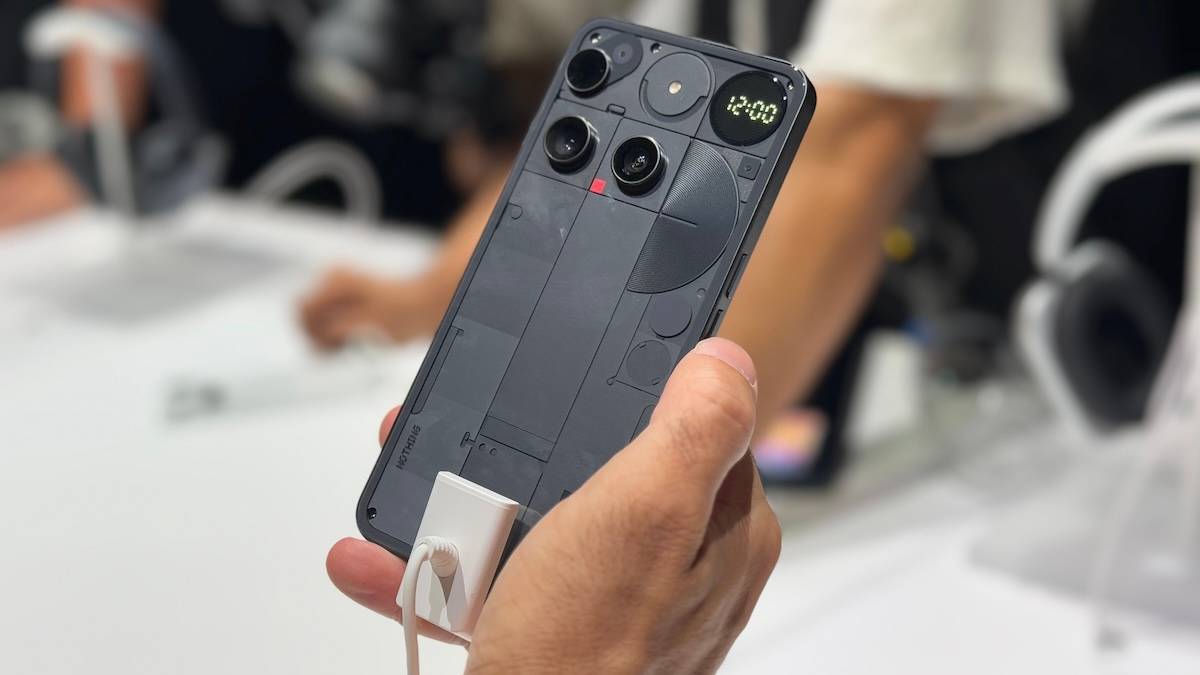
Bragging in asymmetry?
The cameras on the Phone (3) are asymmetrical, which can feel off because our brains are just wired to like symmetry. “There is beauty in symmetry” is a common expression that holds true in pretty much all aspects of life, including phone design. OEMs like Apple and Samsung are big fans of symmetry. The iPhone 16 and Galaxy S25 feature clean and minimalist backs with vertically aligned, symmetrical cameras placed in the top-left corner. They look alike in a lot of ways: premium, minimal, and clean. High-end buyers have come to expect this formula. Then along comes the Phone (3).
Nothing consciously decided to make the layout asymmetrical, to remove you from your comfort space, to get you talking about the Phone (3) on social media, and thereby bring more attention to it. And maybe that was the point. Think about it, the Nothing Phone (3a) Pro (review) also had an asymmetrical camera layout within a circular module, but it didn’t cause nearly as much stir as the Phone (3)’s design, at least if you go by the sheer volume of comments on social media after its launch.


(right).
This is Nothing’s first “true flagship” smartphone, and they wanted the world to know. They wanted the Phone (3) to look as different as possible from the iPhone 16 and Galaxy S25, so that buyers (and yes, there are buyers, as per Carl Pei’s tweet on pre-orders being good) can flaunt a uniquely designed phone that not everyone else is carrying. If there’s beauty in symmetry, there’s bragging in asymmetry.
That’s not to say there’s no symmetry in the Phone (3) at all. If you keep aside the off-centre top camera, the LED flash in a circular cutout is almost the same size as the glyph matrix next to it. The bottom two cameras are symmetrical in shape and alignment. The three-column grid has a geometric symmetry to it. There’s some order amidst the chaos here, if you look for it. And this design language has grown on me ever since I started using the phone.
A natural evolution?
The Glyph Interface in past Nothing phones looked fun. They lit up when you got calls or notifications. It made you want to keep the phone display down, thereby reducing screen time to some extent. The Glyph Matrix is a natural progression towards making the back more interactive and still less distracting than seeing the display. You now get a small circular display that is visually interactive, can show names and notifications, fun little games to play with friends, and a lot more that’s to come as it opens up to developers. As Carl Pei tweeted, Android 16’s Live Updates “will open up a lot of possibilities for Glyph Matrix.”
In a conversation with Tech Radar, Nothing’s AI lead, Sélim Benayat said the Phone (3) will help people “regain focus” and “be more human” as Glyph Matrix will force users to “put the phone face down onto a table to experience it. That helps you, as a human, gain more control again, right? You’re not constantly looking at your screen. You’re not constantly getting the notifications. It puts you more in the present moment.”
It’s clear that the brand is trying to create something fun and unique, with the intention of reducing screen time. But only time will tell whether the Glyph Matrix is a gimmick, something that will lose interest quickly, or a feature that will endure. After all, 8 out of 10 Nothing Phone users say they interact with the Glyph Interface.
The red square, which had no purpose in previous models, now lights up when recording voice or video. It’s a nice evolution from a previously useless small patch to a clear indicator that recording is in progress, especially in a digital age where people can record anything and anyone.
Love it or hate it, the Nothing Phone (3)’s design is a conversation starter, and in today’s saturated flagship market, that might be exactly what Nothing wanted.

