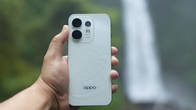
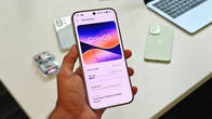
If you thought ColorOS 16 on OPPO smartphones featured tons of glass and light elements, the bar could be set even higher with the upcoming ColorOS 17 update. According to a Weibo post from the renowned tipster, Digital Chat Station (DCS), OPPO is set to bring visual upgrades across the board that could make ColorOS appear more in line with Apple’s iOS. While we’re still months away from getting our first official look at ColorOS 17, here’s what we’ve obtained from DCS today.
Table of Contents
ColorOS 17 design could gain a major uplift in multiple areas
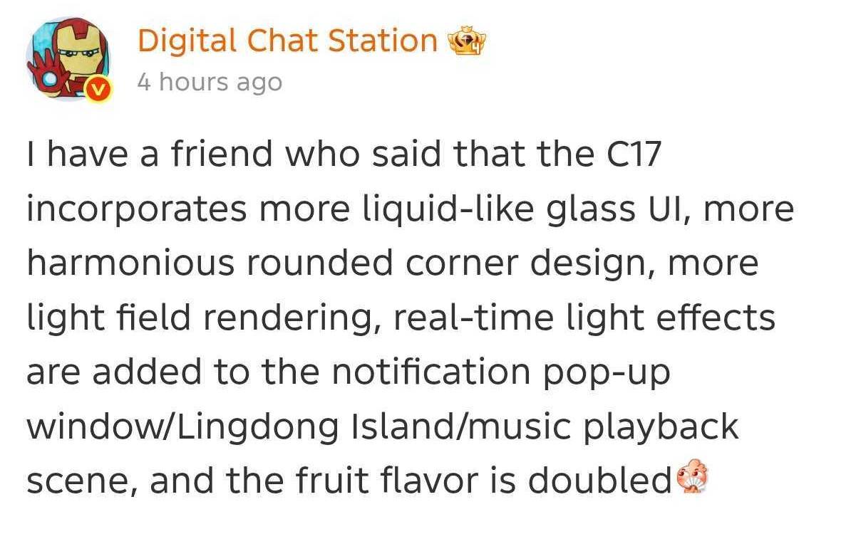
According to DCS, who has apparently sourced the information from a friend, ColorOS 17 is likely to introduce more liquid-glass-like visuals and real-time light rendering in several parts of the UI. Apart from that, the corners of the overlays or pop-up menus may gain harmonious rounded corners, a design strategy to make the UI appear more welcoming and user-friendly.
In the current iteration of ColorOS, i.e. ColorOS 16, OPPO follows the “Luminous Design” framework, which adds light and frosted glass design in the notification panel, app drawer, notification banners, number pads and buttons, and multiple first-party apps like Photos, Calculator, Phone, etc. So, if we are to believe DCS, OPPO could further revamp or improve how the glass-light design appears in these elements.
He also notes that real-time light effects could be added to notification pop-up windows and the music Live Alert. Currently, both the notifications and live alert overlays carry a Gaussian blur, at least on the high-end OPPO smartphones with capable hardware to render such effects. It’ll be interesting to see how OPPO will incorporate light visuals to these areas, which have predominantly carried blur visuals for years.
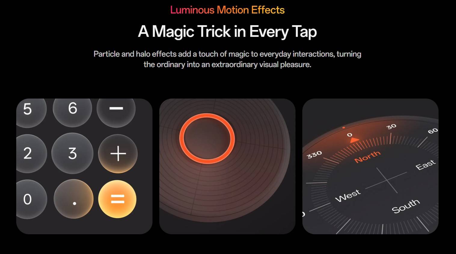
How will ColorOS 17 be positioned among other skins
Apart from the revamped and upgraded visuals, OPPO is likely to further enrich the smoothness and fluidity of the software, as has been the case with every major ColorOS release over the past few years. AI features could also remain one of the strongest highlights of the upcoming Android software, as we’ve already seen on ColorOS 16.0.7, which recently debuted on the OPPO Find X9 Ultra and Find X9s.
OPPO, along with several other Android manufacturers, has embraced liquid-glass design elements inspired by Apple’s iOS in recent times. For instance, Vivo’s OriginOS 6 features glass-like elements across the lockscreen clock, Quick Settings panel, and other areas. Similarly, Xiaomi’s HyperOS 3 draws several cues from iOS in its notification panel and Hyper Island animations. This appears to be a growing trend among Android brands, likely aimed at making iPhone users feel more at home when switching to Android.