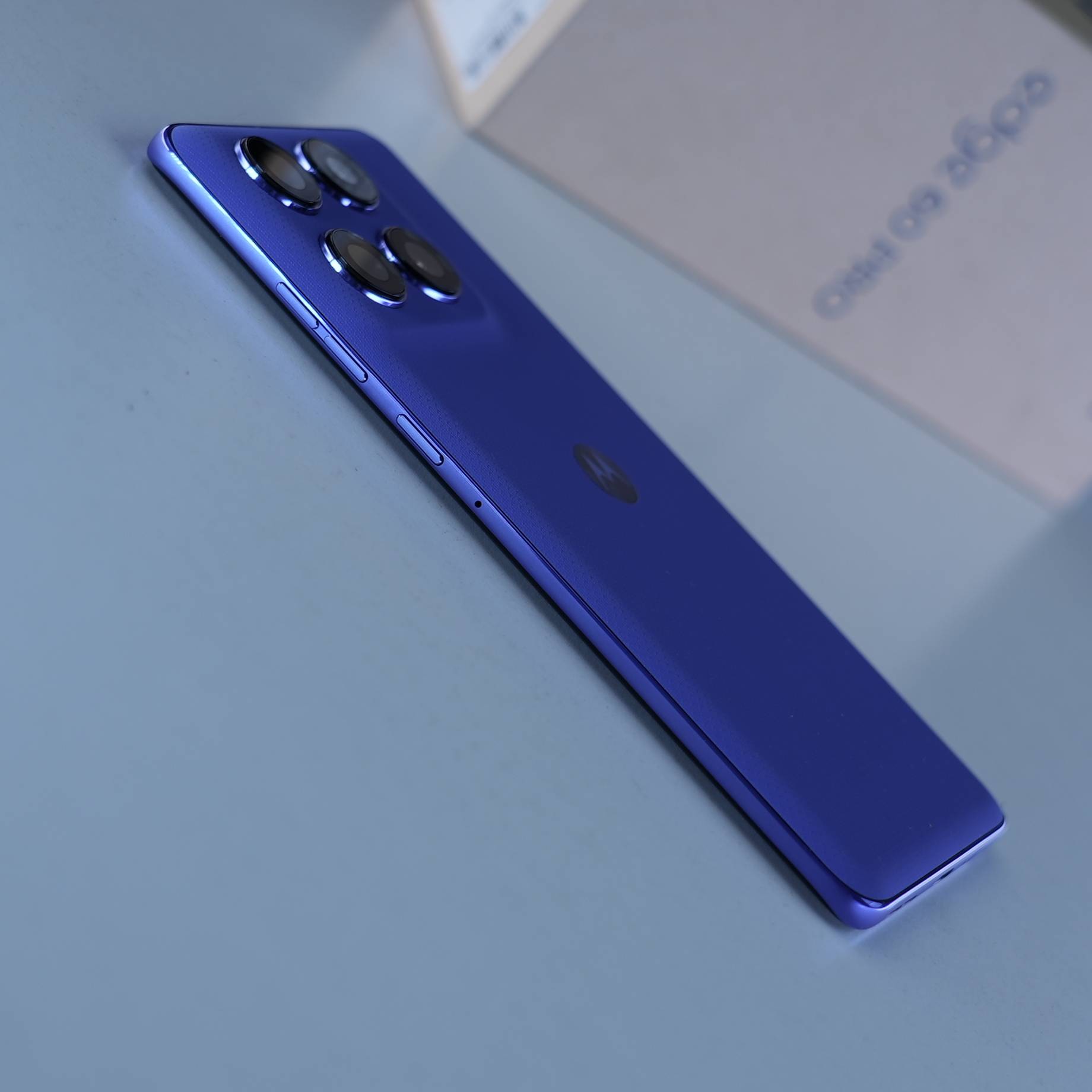
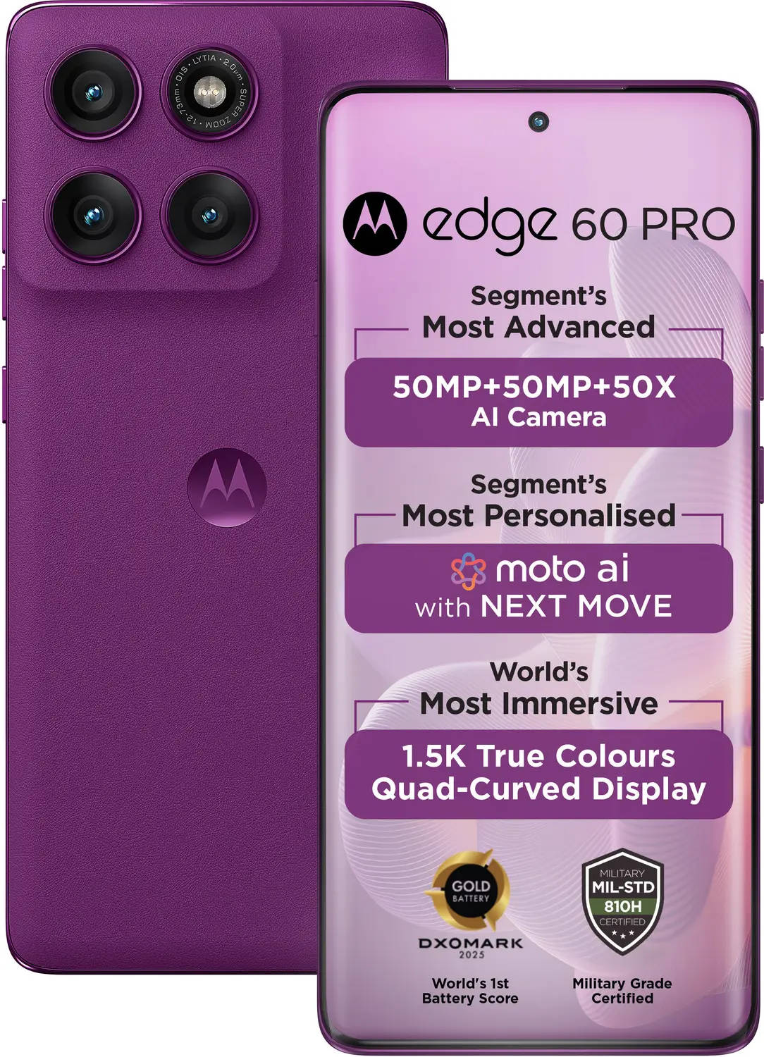
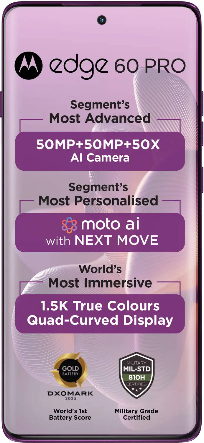
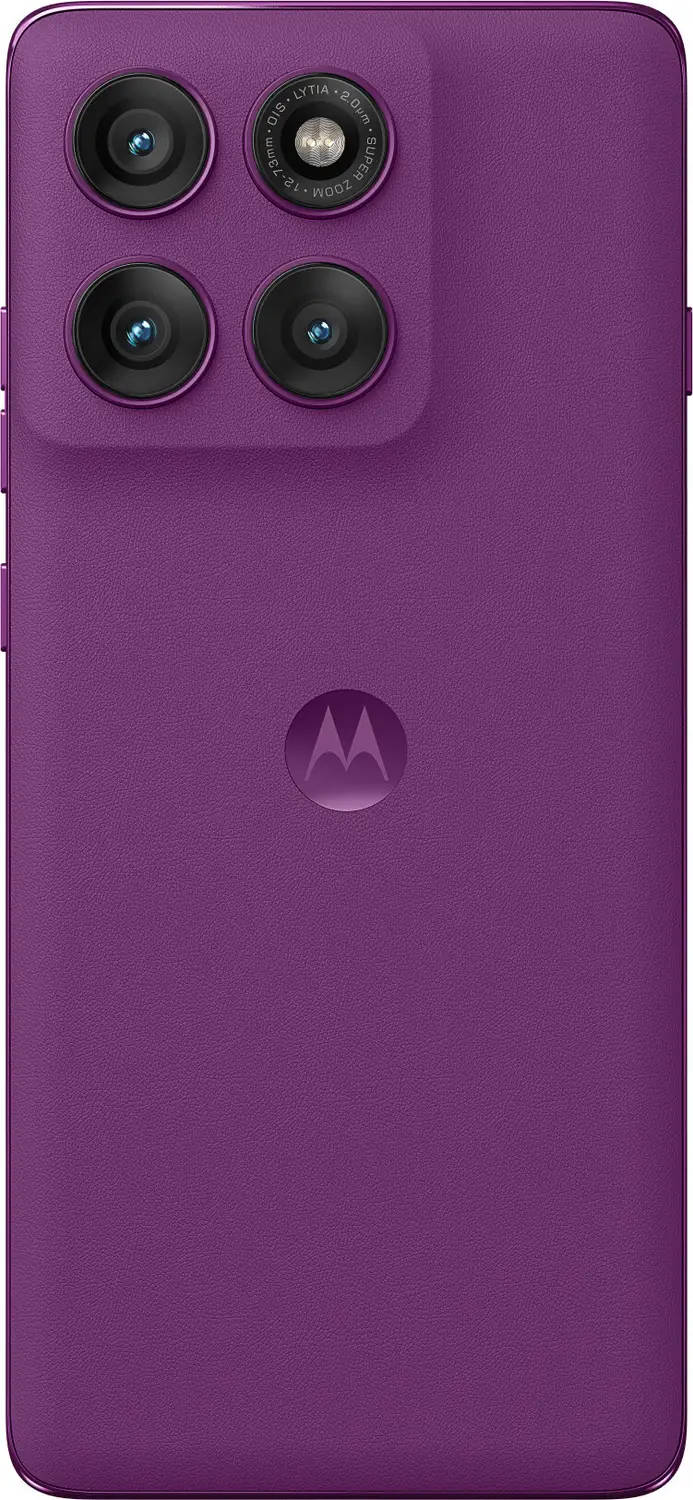
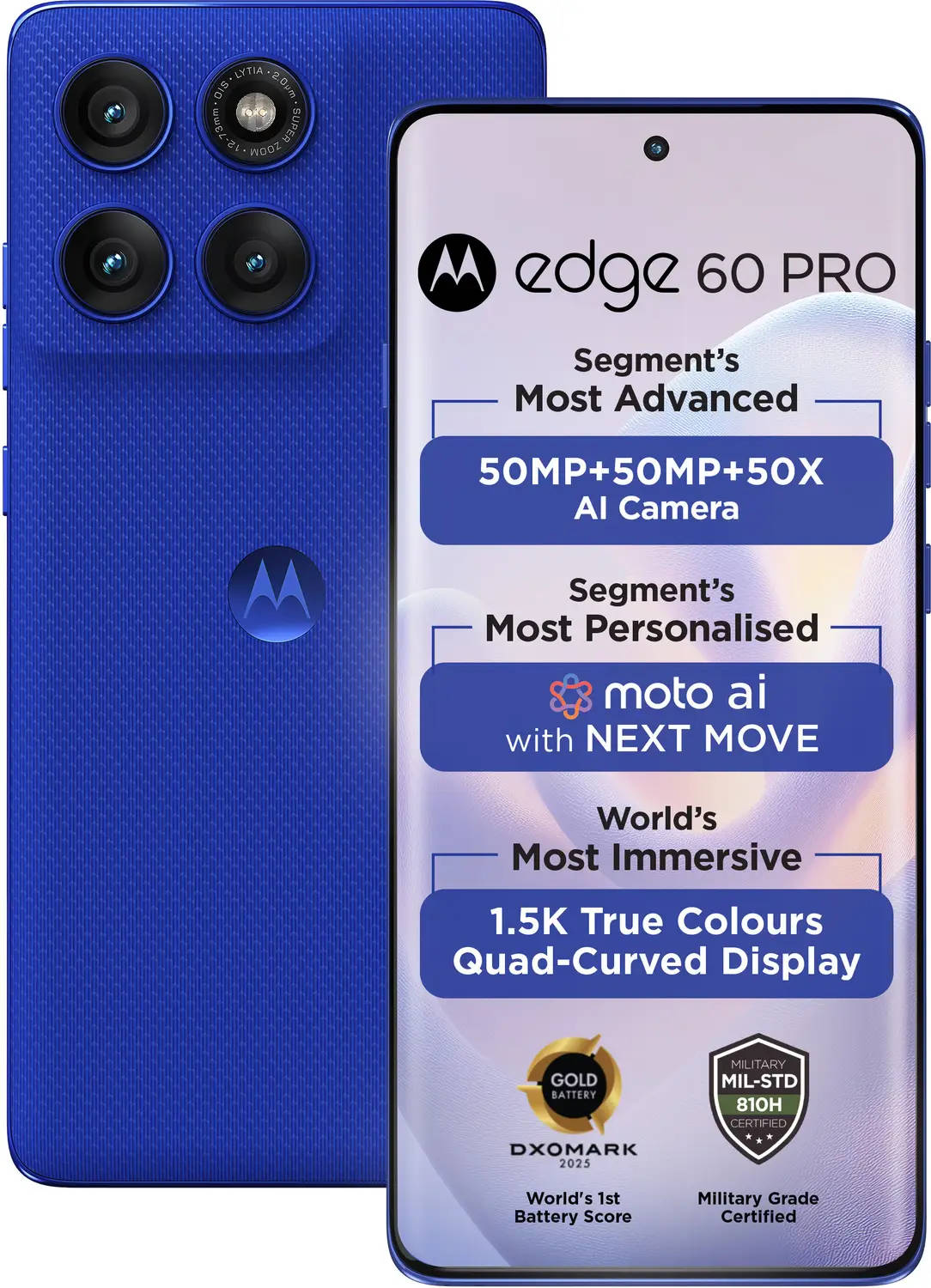
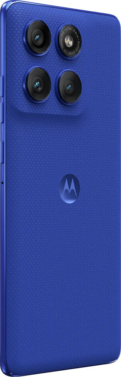
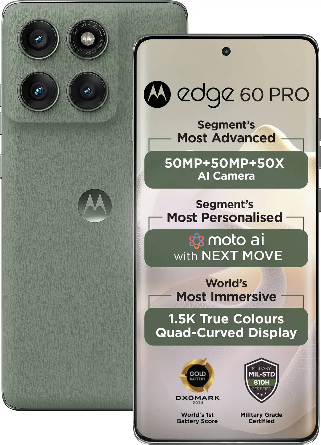
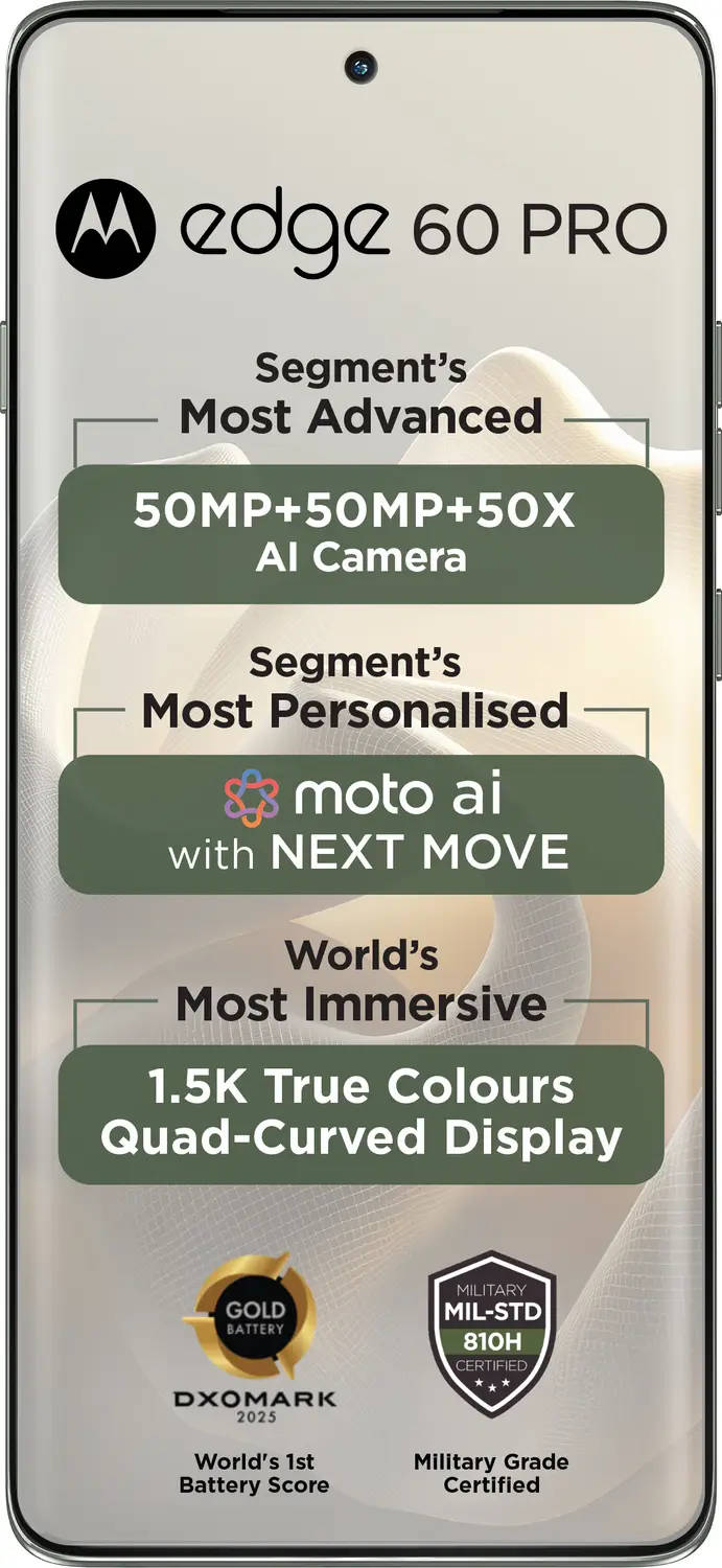
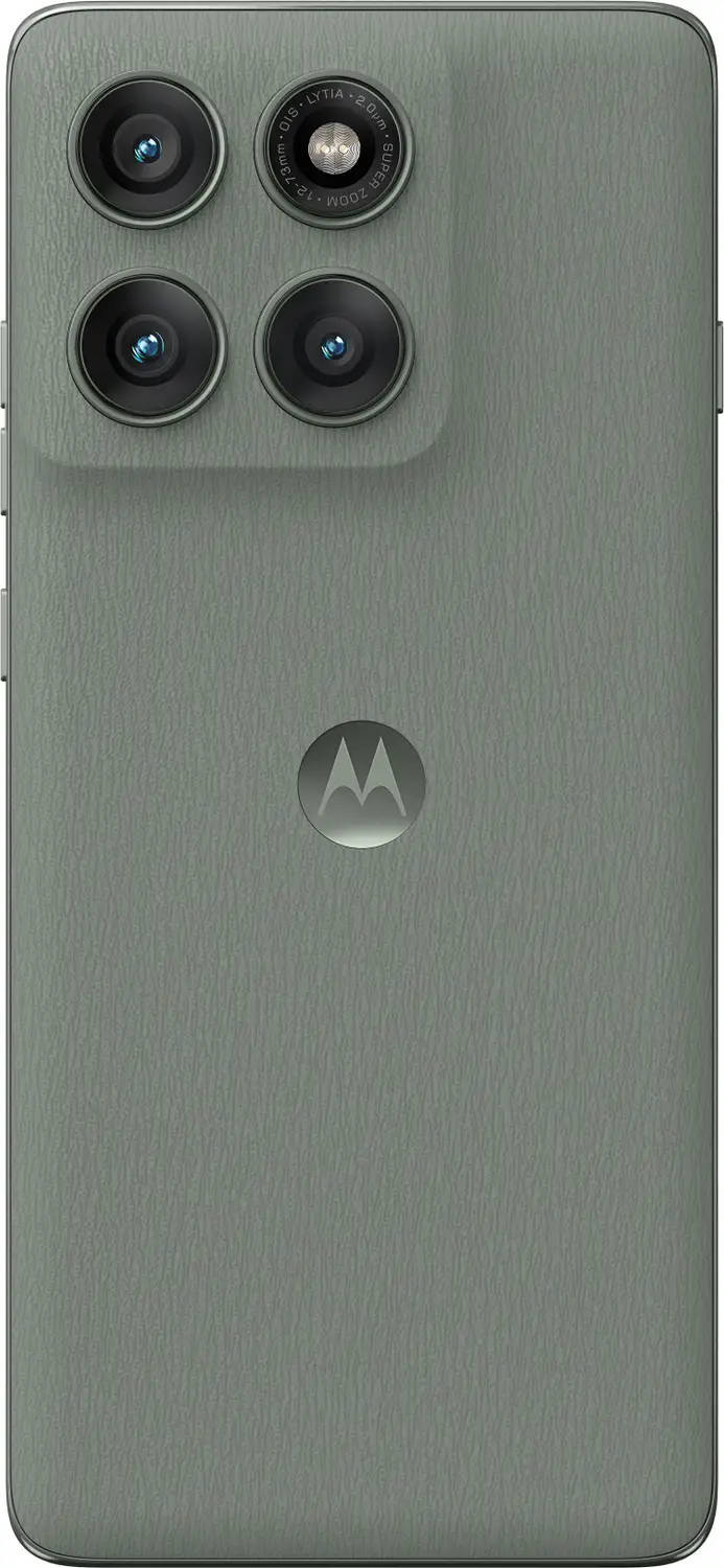
Ahead of the Motorola Edge 60 Pro launch in India, we spoke with Ruben Castano, VP of Design, Brand and CX at Motorola Mobility. He shared insights into the design philosophy behind the Motorola Edge 60 Pro and the broader Edge 60 lineup, touching on the brand’s exclusive partnership with Pantone and the emphasis on elements like colour and durability. He goes on to say how design plays a defining role in shaping a brand’s identity over time. Read on.
Table of Contents
Tell us about how design works as a differentiator for Edge 60 Pro.
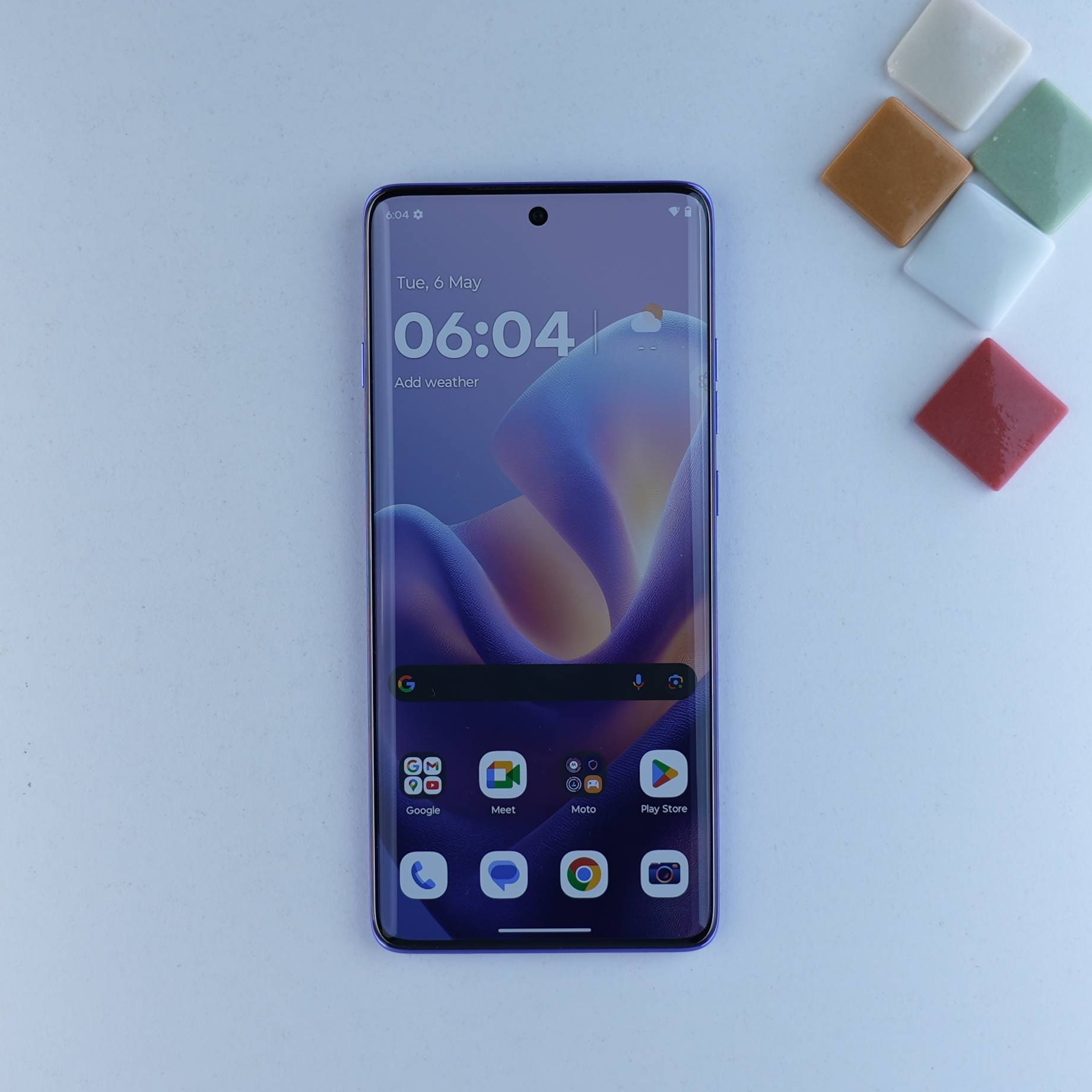
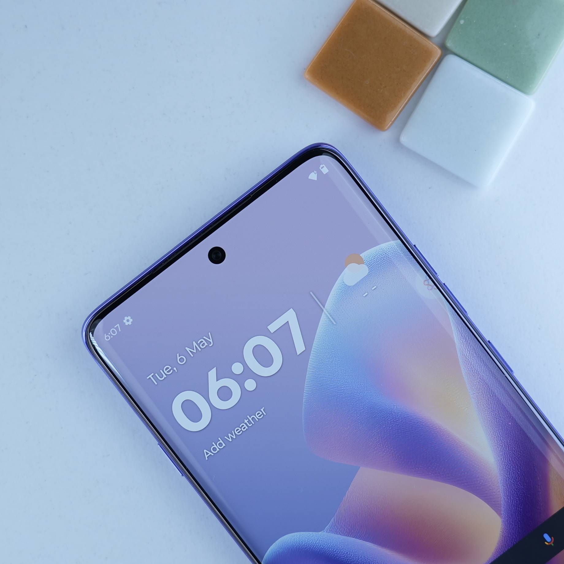
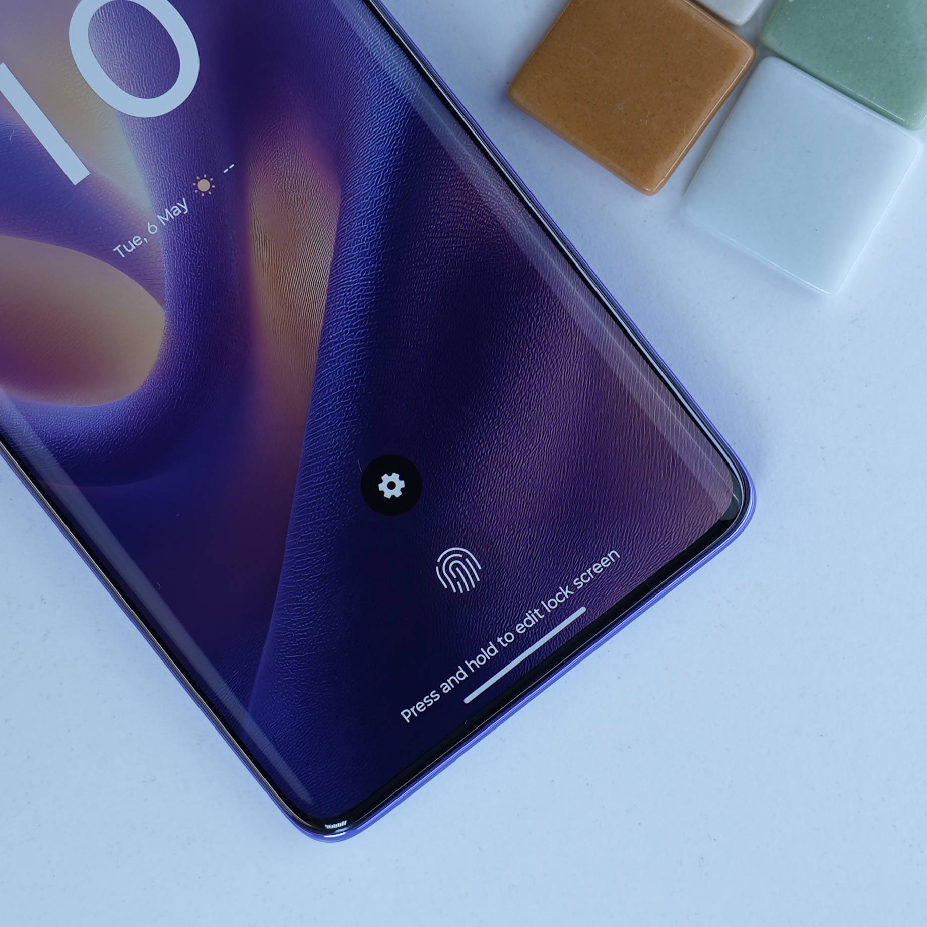
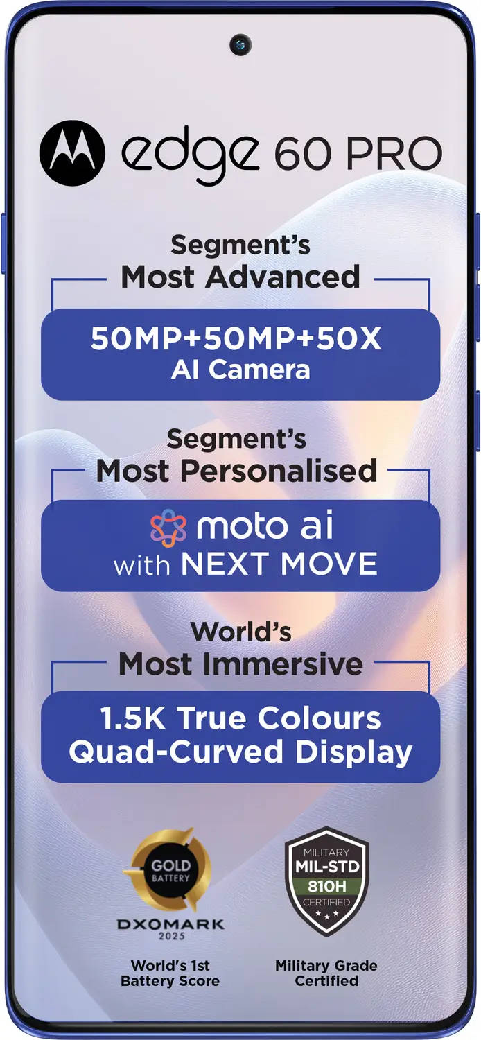
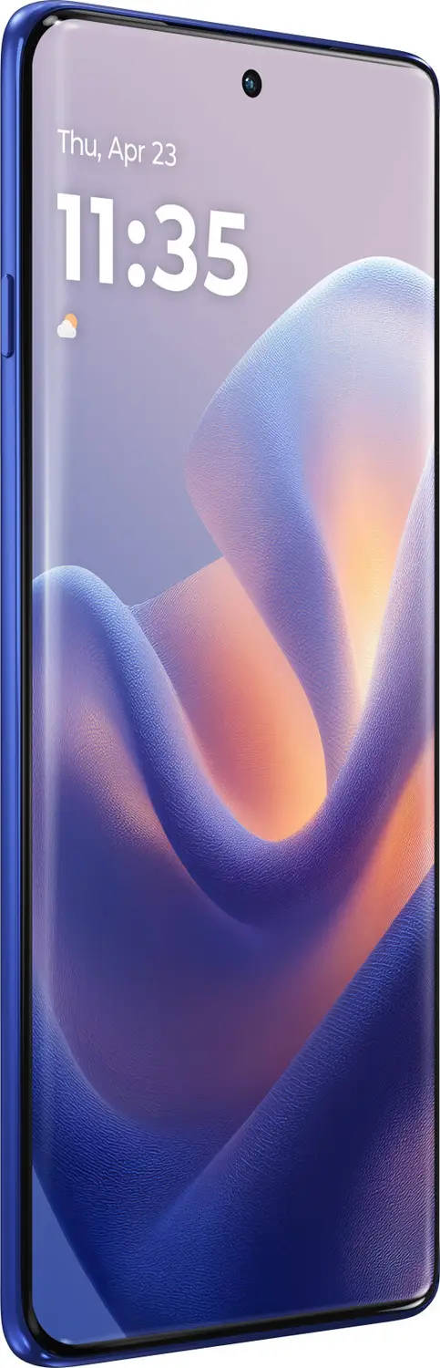
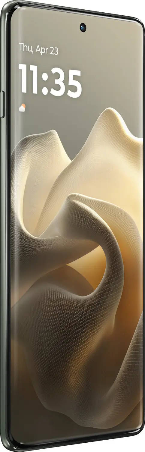
From a design perspective, we actually did the whole Edge 60 line based on some common elements. Why? Because we believe they add tremendous value for the consumer. So, from a design point of view, the Edge 60 Pro comes with a true quad curve display. A quad curve display is important because it actually reduces the borders. It actually creates a better viewing experience of content.
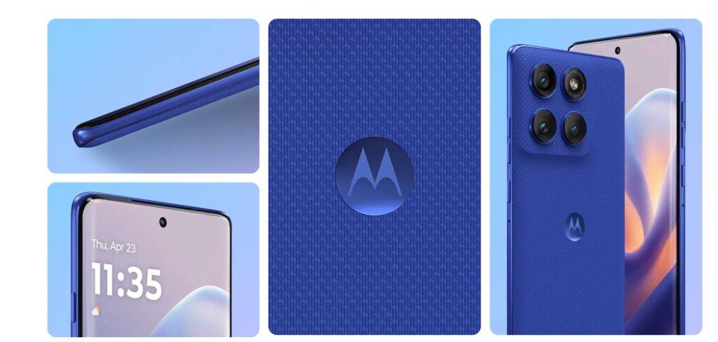
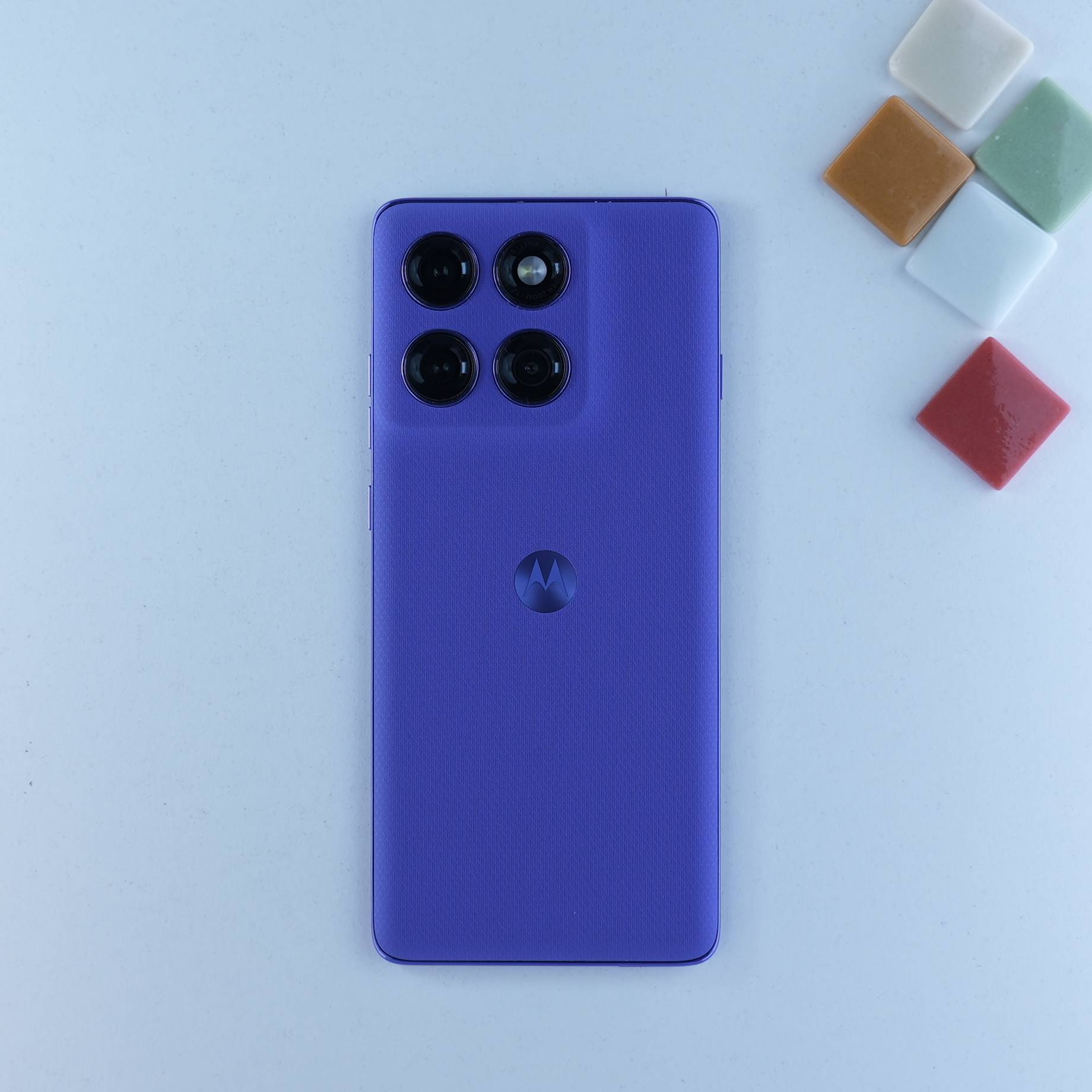
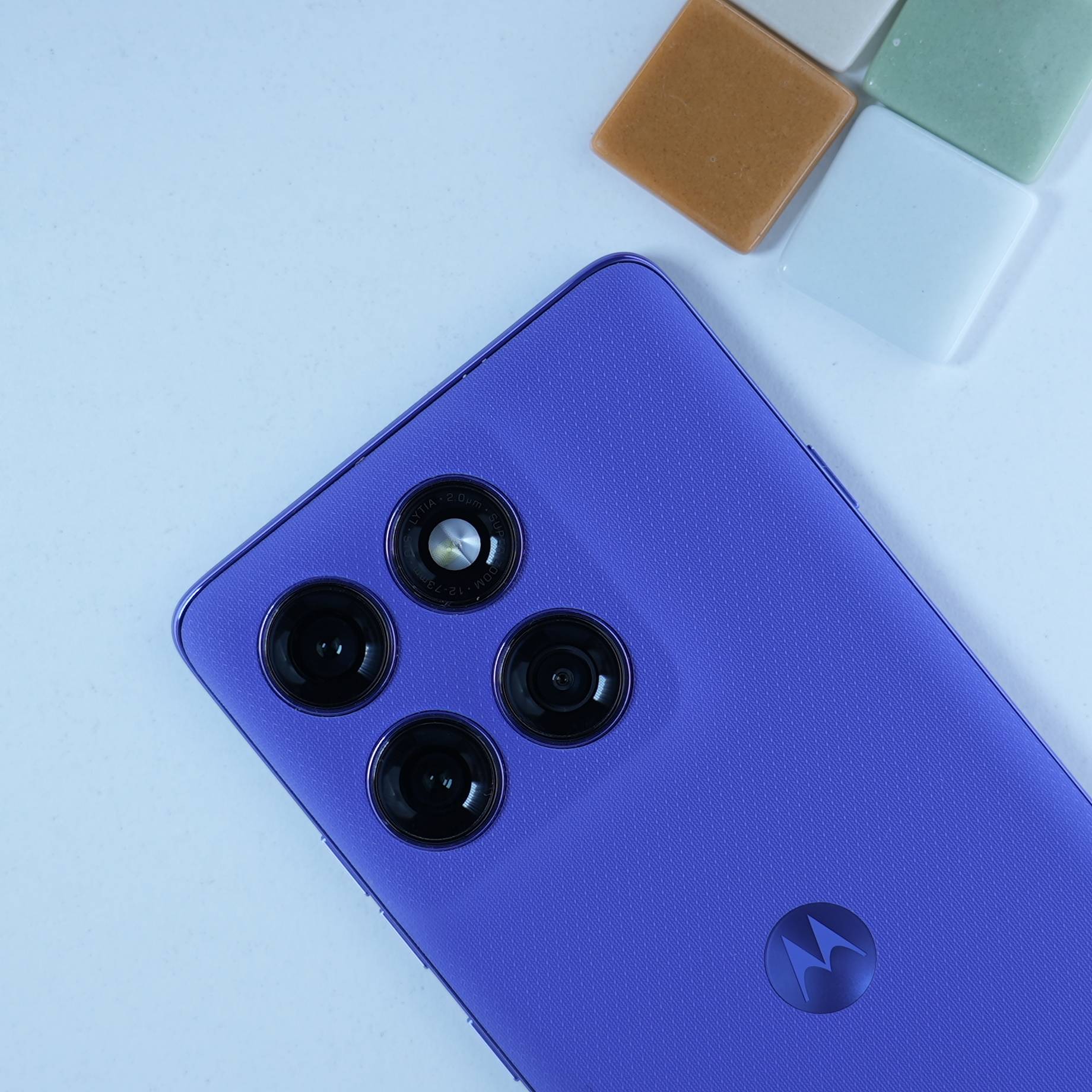
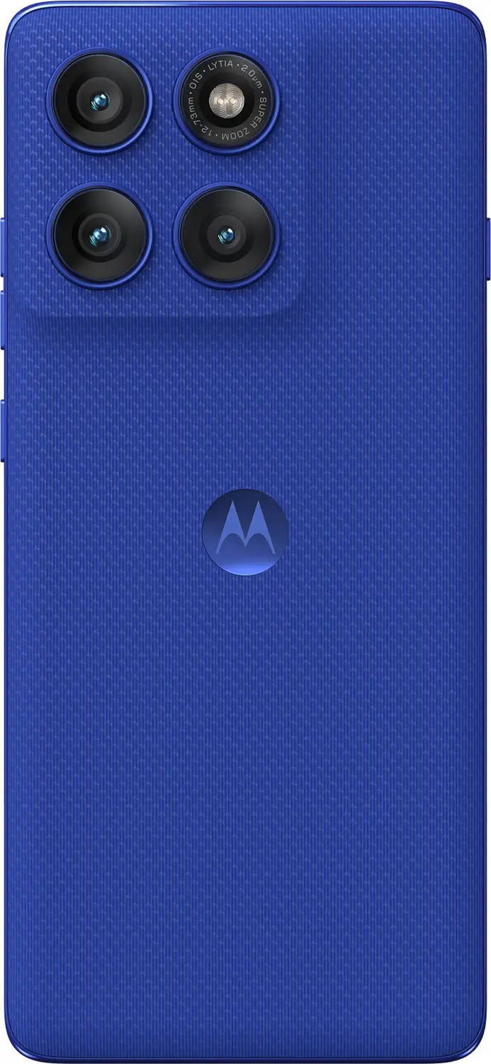
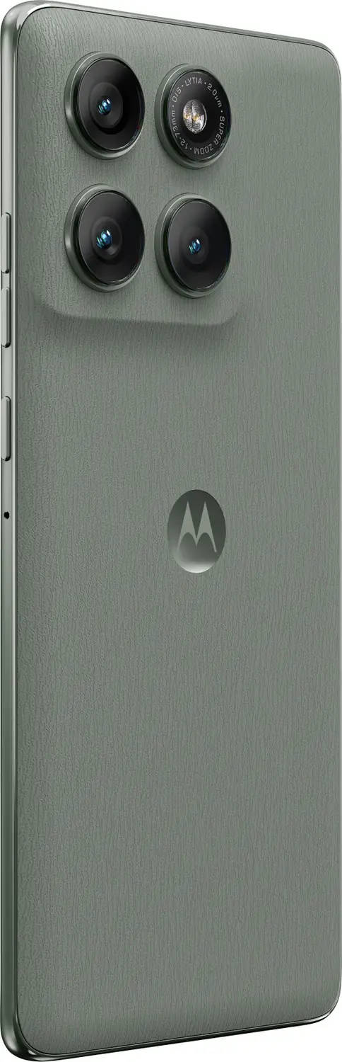
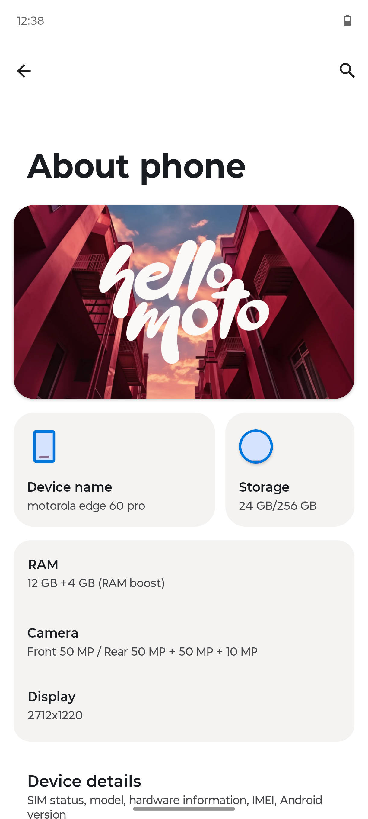
This device, despite being extremely thin and lightweight, has a very large battery. It’s a 6,000 milliamp battery inside, which is of tremendous use for consumers. On the Edge line, you also get a top-of-the-line camera system with a Sony LYTIA 700C sensor, an ultra-wide camera, a 50 megapixel selfie on the front, etc.
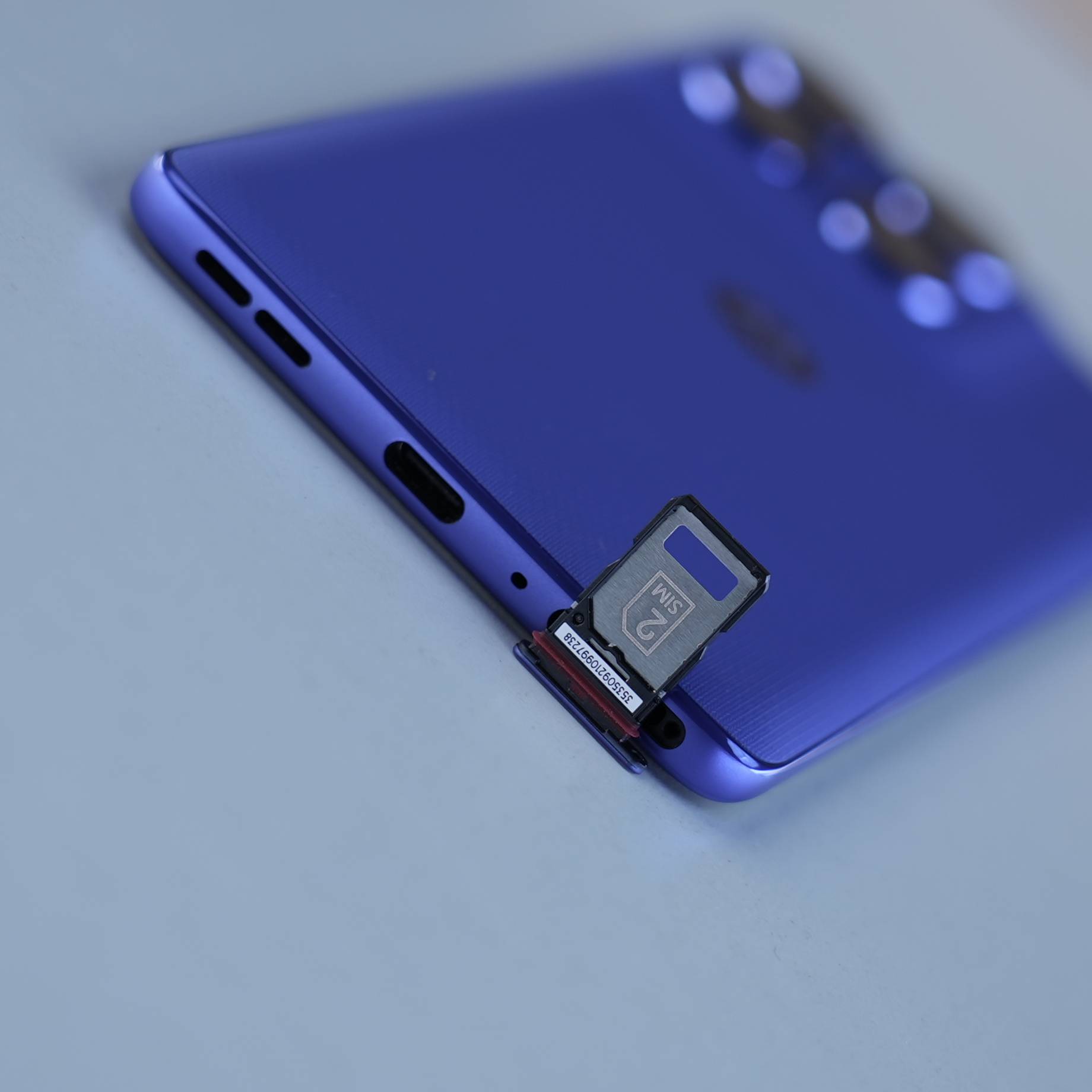
The other very interesting aspect of the design, beyond Pantone colour materials and finishes, is that these devices also come with IP68/69 and military standard certification. So, despite all the work that we do to improve the design year over year, we also believe that because you take these devices everywhere you go, that aspect of durability and peace of mind and everyday use is extremely valuable for consumers, especially in a market like India.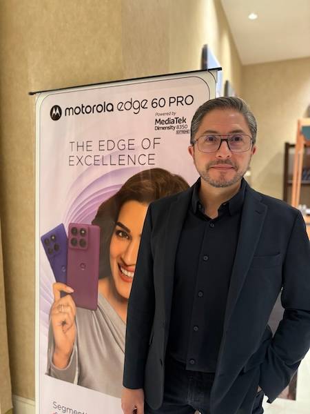
Tell us about your partnership with Pantone, and how it gives Motorola an edge, no pun intended
So we’ve been working with Pantone exclusively for about two and a half years. We renewed our partnership with them for an additional three years at the beginning of this year, and why did we do that? Well, because it’s a perfect match to our strategy, which is to infuse our products and our designs with lifestyle elements. We want to become the reference brand in the mobile industry in terms of lifestyle. We will continue to innovate with technology. We will continue to compete in terms of specs, features and price. That’s not an issue for us as a brand, but where we start adding even more value to the consumer is when we make this very personal piece of technology, also an element of self-expression and an element of lifestyle.
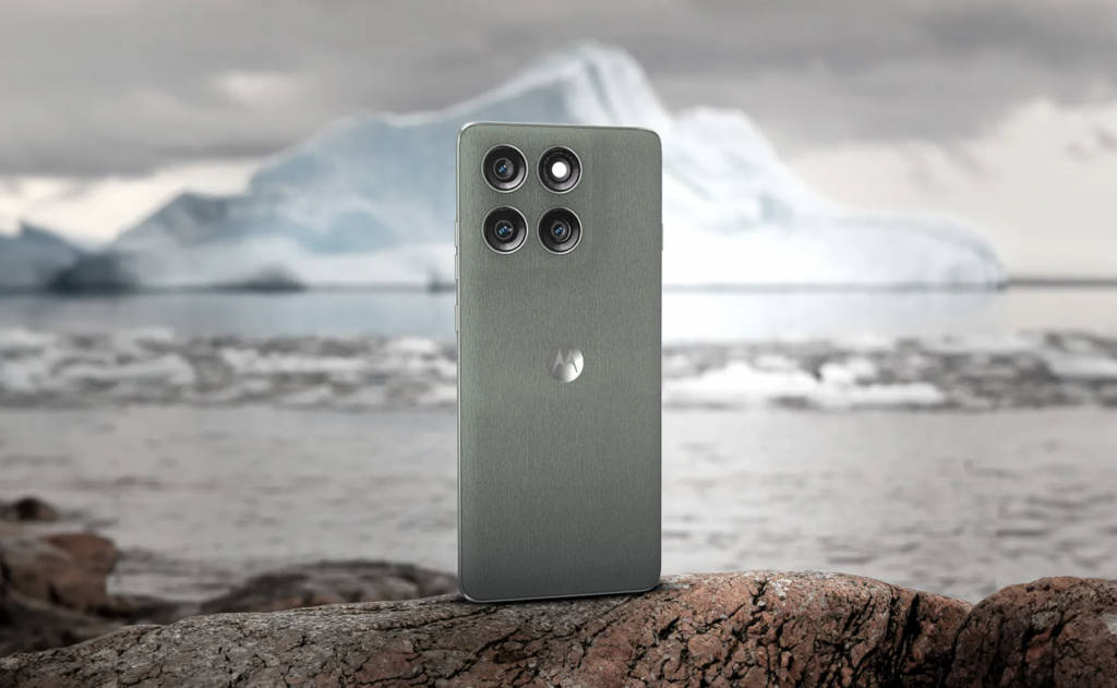
And that’s where the partnership with Pantone plays a tremendous role. There, they have a global expertise, a global network of people that work across many different vertical industries, from apparel to fashion to furniture to automotive to consumer electronics and other categories. But beyond working in all these industries, their experts really understand cultural trends and social movements, and they’re able to distil all this information into then, what it means to have the right colours at the right time on the right products when they hit the market. Anybody can put colour on their phones. Our competitors can do it as well as we can, but you have to know what the right colours are. You have to have their colours at the right time, because that’s when you start to connect emotionally with consumers. You and I are influenced by the colours we see on the street when we are shopping in a physical outlet or online, and having access to that information early on, which is what Pantone gives us, is what allows us also to then put the right colours at the right time on the right products.
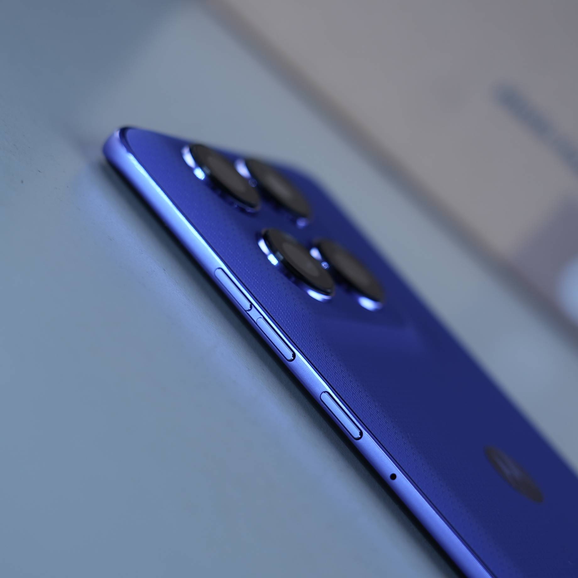
And once we select those colours, there’s a lot of work that we do in terms of bringing the colour to life from a texture and tactile perspective. There’s not a simple copy and paste of the same formula, product after product after product. We are always developing new versions of our vegan leathers, new textiles, and new textures. We are now developing the feeling of different materials like canvas or leather or silk, or performance fabrics directly into the look and feel of our devices, because, again, that gives elements of lifestyle into the design of the phone.
From a CMF perspective, what are the challenges you guys face while converting a design on paper to reality?
Well, obviously, durability and quality are top of mind for us. This includes the fit and finish of the product. The perceived quality is top of mind for us. But in the background, there’s a lot of testing, there’s a lot of engineering, there’s a lot of work that needs to happen to ensure that these devices can withstand the Military Standard certification, and also support the IP68/69 certifications that are present on the entire Edge lineup. So most of the work, beyond the “fun” part of the work, which is selecting the colours and then developing these amazing textures and finishes, is then geared towards quality, both perceived quality, as well as durability over the lifespan of a product.
How difficult is it to marry durability with various other elements of design, like aesthetics, material, etc?
It is because these devices improve, sometimes significantly, generation over generation. And there would be an easier path to take, which is to get enhancements. You can make it bigger, you can make it heavier, you can make it bulkier. But it’s actually quite the opposite. To improve generation over generation, all those features need to get better, like the battery, like the chipset, like the cameras, but the device also, as the consumer needs it to get smaller, more lightweight, easier to manage, less prone to overheating and so on.
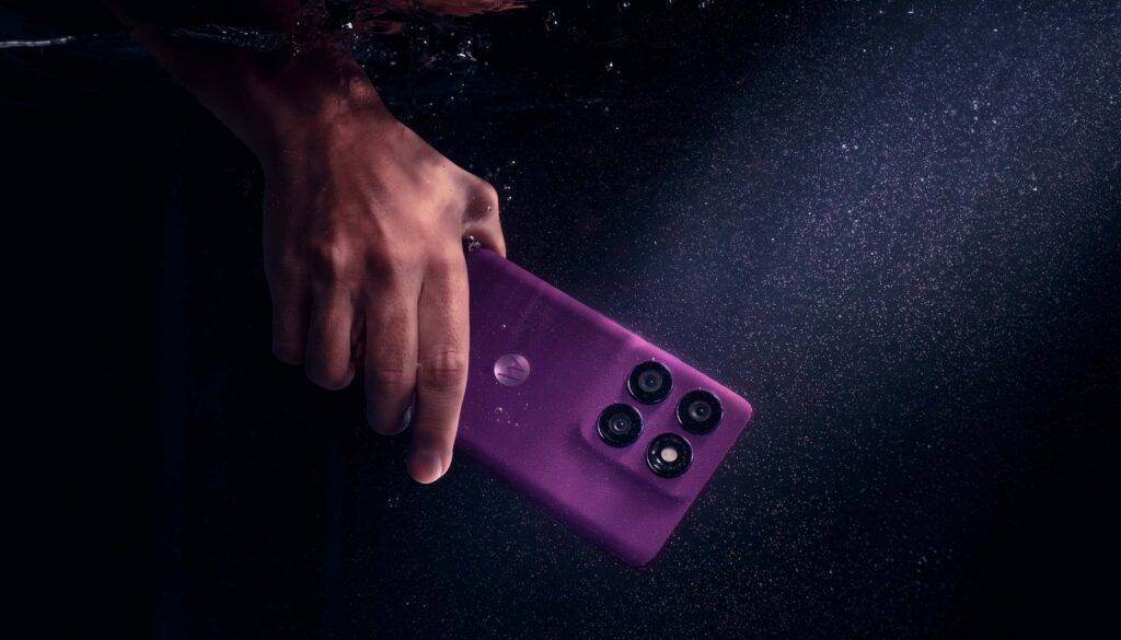
So that’s the work that happens behind the scenes, also between my team and the Motorola engineering teams, of making sure we’re also making improvements in those less tangible areas. But they are so impactful for the consumer. The weight, the size, the overall thickness of the device- they all have to go in almost the opposite direction of reducing, reducing, reducing, while everything else is increasing, increasing, increasing in terms of performance.
From a brand identity perspective, what aspects do you have to keep in mind while designing products?
Design, over time, becomes the brand, and they are completely intertwined. You see something, and even if the brand (logo) is covered, you should be able to recognise what the brand is. And if you think of successful brands globally, dark grey, they were actually colours. And when we go and talk to those consumers that bought those devices, we understand that certain colours helped us reach new consumer segments, maybe younger, maybe we needed to grow with a female segment in a specific market, and so we use colour and design specifically to address that consumer and to grow that consumer segment.
So it’s all very connected. You can definitely use design to build brand recognition, but you can also use all these other elements of design to expand reach and to connect with more and more consumers, which a more generic brand could not do, because it tries to appeal to everybody. We’re doing a little bit of the opposite. We’re trying to be very tactical and strategic in our use of colour to actually expand reach, and the results over the last few years have proven that strategy works.
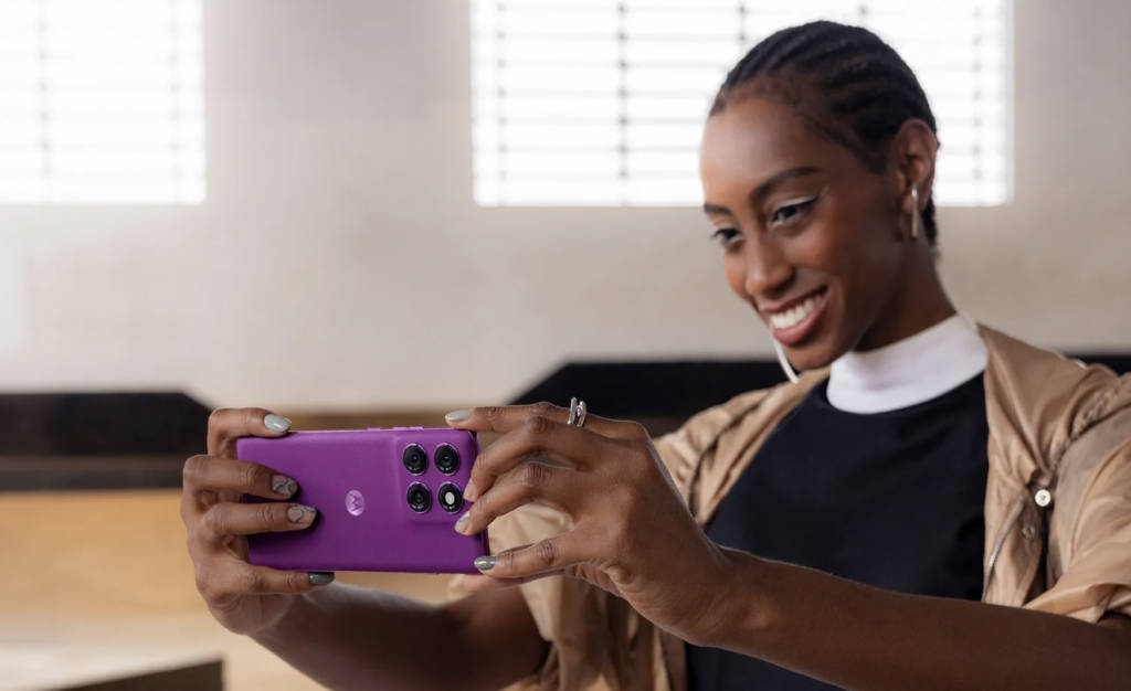
No, I think colour definitely generates an immediate reaction and does grab your attention. It’s like the beginning of a conversation that then needs to be completed, because consumers will give some weight to the colour of a phone, but they will also put into the scale all the other elements like the design, the specs, the experience, the price, and so on. But using colour in many cases as that conversation starter is quite powerful, because it does generate that emotional reaction. And as human beings, we see so many things through our senses, but our eyes are one of the most powerful ones.
And so, yeah, colour is a great way to start. But no, we need to have a very well-rounded and complete value proposition that goes beyond just a colour on a device. And I think we’re doing that.
Motorola Edge 60 Pro Images